This comprehensive guide teaches beginners how to read cryptocurrency charts and analyze Bitcoin price trends using technical analysis. The article addresses key challenges: identifying optimal entry and exit points, understanding market sentiment, and making informed trading decisions. Content covers essential topics including two primary analysis methods (technical and fundamental), major chart platforms like Gate and TradingView, and critical technical indicators including moving averages, Fibonacci retracement, candlestick patterns, and RSI/MACD indicators. Readers learn to identify support and resistance levels, recognize chart patterns, and interpret timeframes from ultra short-term to long-term perspectives. The guide also explains Bitcoin dominance analysis and order book dynamics. Practical FAQ section clarifies common beginner questions about candlesticks, trend identification, and analysis risks, equipping traders with actionable knowledge for cryptocurrency market analysis and strategy development
Understanding Cryptocurrency Charts
Being able to read Bitcoin charts provides significant advantages when analyzing Bitcoin price movements. It also helps determine optimal buying and selling points for your trading strategy.
In this comprehensive guide, we'll explain how to read charts when investing in Bitcoin or altcoins. Mastering chart analysis techniques will also benefit you when reading investment reports or evaluating the value of other assets across different markets.
How to Read Cryptocurrency Charts
There are two primary methods for analyzing markets: technical analysis and fundamental analysis. Each approach offers unique insights into market behavior and asset valuation.
Technical Analysis vs Fundamental Analysis
| Category |
Technical Analysis |
Fundamental Analysis |
| Objective |
Predict future price movements and market sentiment |
Evaluate intrinsic value of assets and long-term value predictions |
| Analysis Target |
Historical price data, trading volume, chart patterns, technical indicators |
Company financial status (financial statements), industry trends, economic indicators, macroeconomic environment |
| Key Question |
"When and in which direction will this asset move?" |
"What is the current value of this asset?" |
| Tools Used |
Candlestick charts, moving averages, RSI, MACD, Bollinger Bands |
Financial statements, economic reports, news, industry reports, company analysis materials |
| Time Horizon |
Short-term, medium-term investment and trading (capturing entry/exit points) |
Long-term investment (value investing) |
| Advantages |
- Quick response to market changes. Applicable to various assets |
- Identifies fundamental value for stable investment. Provides long-term perspective unaffected by short-term volatility |
| Disadvantages |
- Based on historical data, cannot guarantee future outcomes 100%. - May become 'self-fulfilling prophecy'. - Vulnerable to unexpected external factors |
- Requires significant time and effort. - Intrinsic value assessment can be subjective. - Market price may take long time to reach intrinsic value |
This article primarily focuses on the technical analysis approach, providing practical tools for chart reading and interpretation.
What Is Technical Analysis?
Technical analysis begins with examining current market conditions through systematic observation. By analyzing price charts, traders can identify trends, support and resistance levels, and momentum to increase their probability of successful investments.
This methodology operates on the premise that asset prices move in trends and can fluctuate based on market sentiment. The analysis assumes that traders tend to react similarly when facing comparable situations, creating recognizable patterns in price movements.
Technical analysis employs mathematical indicators, numerical values, and cryptocurrency chart patterns to forecast future price movements. By understanding these tools, traders can make more informed decisions about market entry and exit points.
Bitcoin Chart Websites and Real-Time Coin Charts
The cryptocurrency market, including Bitcoin, experiences rapid fluctuations, making real-time chart monitoring and analysis essential. Various platforms offer Bitcoin charts, each with distinctive features allowing users to select the most suitable option for their needs.
Cryptocurrency Exchanges
The most direct method involves checking charts on major cryptocurrency exchanges where Bitcoin is traded. Most exchanges integrate powerful charting capabilities alongside their trading functions, providing seamless analysis and execution.
Leading platforms include major exchanges that offer detailed technical analysis tools with high trading volumes, ensuring chart reliability. These platforms typically provide comprehensive charting features with various timeframes and indicators.
Advantages: Convenient integration of trading and chart analysis. Most accurate real-time price reflection directly from the exchange.
Disadvantages: Slight price variations may exist between different exchanges due to regional demand and liquidity differences.
Specialized platforms focus primarily on chart analysis rather than trading functions. These platforms provide more extensive and powerful analysis tools, often integrating data from multiple exchanges for comprehensive market views.
TradingView stands as the world's most widely used platform for chart analysis across all financial assets, including cryptocurrencies, stocks, and forex.
- Features: Hundreds of technical indicators, diverse drawing tools, community-based idea sharing, and flexibility to select Bitcoin chart data from various exchanges. The free version offers robust capabilities, while paid subscriptions unlock additional advanced features.
- Recommendation: TradingView represents the optimal choice for professional chart analysis or utilizing diverse indicators in your trading strategy.
Other platforms provide comprehensive cryptocurrency information including market capitalization, prices, and trading volumes. These websites often integrate professional charting tools, sometimes embedding TradingView charts directly on individual coin pages.
Advantages: Powerful chart analysis tools with extensive customization options. Ability to view data from multiple exchanges simultaneously for market-wide perspective.
Disadvantages: Some advanced features may require paid subscriptions. Direct trading functionality is not provided on analysis-focused platforms.
For quick checks of Bitcoin price trends or basic chart information, several convenient options exist. Major financial portals and cryptocurrency-focused websites provide price information and forecasts for major coins.
Global financial news sites offering market information frequently include price feeds and charts for major cryptocurrencies, making them accessible resources for quick market checks.
Advantages: Quick and convenient price checking with minimal navigation required.
Disadvantages: Professional chart analysis tools are typically limited compared to dedicated platforms.
Moving Averages
Moving averages represent commonly used technical indicators in cryptocurrency charts. They filter out random noise from short-term price fluctuations and provide lagging indicators that track trends effectively. Two primary types exist: simple moving averages and exponential moving averages.
Simple and Exponential Moving Averages
- Simple Moving Average (SMA) – Calculates the average price over a specified period, giving equal weight to all data points within that timeframe.
- Exponential Moving Average (EMA) – Assigns greater weight to recent dates when calculating the average price, making it more responsive to recent price changes.
Moving averages indicate when trends may reverse, with various calculation periods available for different trading strategies.
The most commonly used moving averages in cryptocurrency charts are the 50-day and 200-day periods, serving as key benchmarks for medium to long-term trend analysis.
These two indicators prove valuable for identifying upper and lower bounds in future price movements and pinpointing major trend reversal points.
When these two moving average lines cross, it signals a potential trend change. Two significant crossover patterns exist: the Golden Cross and the Death Cross.
- Golden Cross – Occurs when the 50-day moving average crosses above the 200-day moving average, suggesting the price may shift to a bullish trend with increased upward momentum.
- Death Cross – Occurs when the 50-day moving average crosses below the 200-day moving average, indicating the price may shift to a bearish trend with increased downward pressure.
Additionally, moving average lines provide information about support and resistance levels, helping predict at which price points momentum may develop or reverse.
Support and Resistance Levels
Support and resistance constitute core concepts when working with cryptocurrency price charts. Resistance levels represent price points where upward movement tends to stall or reverse, while support levels indicate price points where downward movement tends to halt and reverse upward.
When prices repeatedly fail to break below a certain level and bounce back to similar levels, the support level strengthens. Conversely, when prices repeatedly fail to break above a certain level and fall back from similar heights, the resistance level gains strength.
When prices break through these levels, traders call it a 'breakout,' prompting searches for the next support or resistance zone above or below the breakthrough point.
Understanding how to identify these support and resistance areas significantly aids in grasping market trends and planning strategic entry and exit points for trades.
Fibonacci Retracement
Fibonacci retracement analysis provides a useful method for predicting future price trends by analyzing historical price and volume data. This technique leverages mathematical relationships found throughout nature and financial markets.
Fibonacci ratios include 0.236, 0.382, 0.500, 0.618, and 0.786. These ratios derive from the Fibonacci sequence and frequently appear in stock or cryptocurrency fluctuations, representing natural proportions that markets tend to respect.
When using Fibonacci retracement analysis to examine charts, traders identify Fibonacci levels or ratios in past price movements and apply them to current price action. This approach helps identify support and resistance levels while predicting whether trends will reverse or continue.
For example, when cryptocurrency prices follow an upward trend, support levels may form at Fibonacci retracement levels of 0.382 or 0.618. Prices often reverse and resume their upward trajectory at these mathematically significant levels, providing traders with potential entry points for positions.
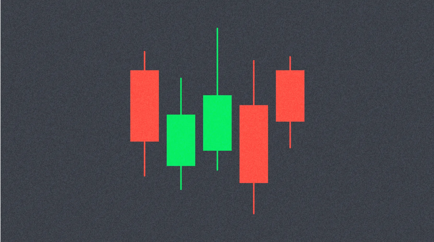
Candlestick Patterns
Candlestick analysis represents a method used to analyze price movements in financial markets including stocks, forex, and commodities. Candlestick charts visually display the opening price, high, low, and closing price for specific periods, making market movements easy to understand. This analysis method originated in Japan centuries ago.
- Opening Price – The first traded price during the specified period
- High Price – The highest traded price during the period
- Low Price – The lowest traded price during the period
- Closing Price – The last executed trade price during the specified period
Each candlestick consists of the following elements:
- Body: Represents the range between opening and closing prices, showing how much the price rose or fell during the period
- Bullish Candle: When the closing price exceeds the opening price, the body appears hollow or white (or green), indicating buying pressure
- Bearish Candle: When the closing price falls below the opening price, the body appears filled or black (or red), indicating selling pressure
- Shadows (Wicks): Lines extending above and below the body, displaying the high and low prices
- Upper Shadow: Located above the body, representing the range between the period's highest price and the body's top
- Lower Shadow: Located below the body, representing the range between the period's lowest price and the body's bottom
Candlesticks help intuitively grasp price movements, and various patterns enable identification of market trends and reversal timing. However, pattern interpretation involves subjective elements, making it advisable to use candlestick analysis alongside various technical indicators for confirmation and validation.
Time Frames
Time frames allow analysis of price movements across various periods, enabling traders to understand both overall trends and short-term volatility simultaneously. Different timeframes serve different trading strategies and investment horizons.
- Ultra Short-Term Time Frames: 1-minute, 5-minute, 15-minute, 30-minute
Primarily used by day traders to capture very short-term price fluctuations and execute multiple trades within a single day.
- Short-Term Time Frames: 1-hour, 4-hour
Employed by short-term traders to analyze price movements over one day to several days, suitable for scalping and day trading strategies.
- Medium-Term Time Frames: Daily, Weekly
Utilized by swing traders or position traders to analyze price trends spanning several days to weeks, identifying medium-term opportunities.
- Long-Term Time Frames: Monthly
Used by long-term investors to analyze long-term market trends spanning months to years, focusing on fundamental value and major trend shifts.
Time frame techniques help investors prepare for unexpected situations by analyzing multiple perspectives. They also enable comprehensive market understanding, facilitating more accurate trading signal identification. However, simultaneously analyzing multiple time frames requires significant time and effort, and subjective interpretation may influence decision-making.
Cryptocurrency Chart Patterns
Cryptocurrency charts frequently display recognizable patterns that help predict future price movements. Understanding these patterns provides traders with valuable insights for timing market entries and exits.
Common patterns observed in Bitcoin and cryptocurrency markets include:
1. Reversal Patterns
Reversal patterns indicate that existing trends may reverse direction, providing crucial signals for position adjustments.
Head and Shoulders
- Head and Shoulders Top: A pattern appearing after an upward trend, forming three peaks with the middle peak being the highest. This suggests the upward trend may reverse to downward movement.
- Inverse Head and Shoulders (Head and Shoulders Bottom): A pattern appearing after a downward trend, forming three troughs with the middle trough being the lowest. This indicates the downward trend may reverse to upward movement.
Double Top and Double Bottom
- Double Top: After an upward trend, two peaks form at nearly identical heights, potentially signaling a downward reversal.
- Double Bottom: After a downward trend, two troughs form at nearly identical depths, potentially signaling an upward reversal.
Triple Top and Triple Bottom
- Triple Top: After an upward trend, three peaks form, potentially signaling a downward reversal with stronger confirmation than double tops.
- Triple Bottom: After a downward trend, three troughs form, potentially signaling an upward reversal with stronger confirmation than double bottoms.
2. Continuation Patterns
Continuation patterns suggest that existing trends will likely persist, providing confidence for maintaining positions in the direction of the trend.
Triangles
- Symmetrical Triangle: Forms as price gradually converges, indicating the existing trend may continue after the consolidation period.
- Ascending Triangle: Formed by a horizontal resistance line and rising support line, typically appearing in upward trends and signaling trend continuation.
- Descending Triangle: Formed by a horizontal support line and falling resistance line, typically appearing in downward trends and signaling trend continuation.
Flags and Pennants
- Flag: A pattern forming a small symmetrical channel after strong price movement, indicating continuation of the existing trend after a brief consolidation.
- Pennant: A pattern forming a small symmetrical triangle after strong price movement, indicating continuation of the existing trend similar to flags but with converging trendlines.
Rectangle
Price moves horizontally, fluctuating within a consistent range, indicating the trend may continue after this consolidation phase breaks in the direction of the prior trend.
Chart patterns provide investors with visually intuitive information, making them widely used not only in cryptocurrency analysis but also in stocks, forex, and various financial instruments. However, not all patterns provide consistently accurate signals, and investors must consider that subjective interpretation can influence pattern recognition and trading decisions.
Additional Technical Indicators
Beyond moving averages and Fibonacci retracement, several essential indicators exist for analyzing cryptocurrency charts effectively. These tools provide complementary perspectives on market conditions.
Relative Strength Index (RSI)
The Relative Strength Index measures whether an asset is overbought or oversold, serving as a momentum oscillator that gauges market strength. This indicator typically displays below the chart on a scale from 1 to 100. Readings below 30 indicate oversold conditions, while readings above 70 suggest overbought conditions, helping traders identify potential reversal points.
Moving Average Convergence Divergence (MACD)
The MACD combines multiple moving averages to create a more precise trend identification tool. This indicator consists of the MACD line, signal line, and histogram.
When the MACD line crosses above the signal line, it generates a buy signal, indicating that short-term momentum exceeds long-term momentum with potential for upward movement.
Conversely, when the MACD line crosses below the signal line, it produces a sell signal, suggesting that short-term momentum falls below long-term momentum with potential for downward movement. The histogram rising above the zero line indicates strengthening upward trends, while falling below the zero line suggests strengthening downward trends.
Stochastic Oscillator
The Stochastic Oscillator compares current prices to the price range over a specific period, evaluating trend strength and price momentum. Developed by George Lane, it assesses the likelihood of trend continuation and identifies overbought or oversold conditions.
The '%K' line serves as the primary indicator: readings above 80 suggest prices have risen sharply in the short term (potentially overbought), while readings below 20 indicate prices have fallen sharply in the short term (potentially oversold), signaling possible reversal opportunities.
Parabolic SAR
SAR stands for 'Stop and Reverse,' meaning traders should take new positions when trends reverse. This indicator helps identify optimal exit points and trend changes.
Parabolic SAR displays as dots above or below the price chart. During upward trends, dots appear below prices; during downward trends, dots appear above prices. When dots move closer to prices and then cross them, it signals a potential trend reversal, prompting position adjustments.
Bollinger Bands
Developed by John Bollinger, this indicator consists of a moving average line with two standard deviation bands positioned above and below it. Bollinger Bands reflect price volatility and help predict the range within which prices may move, providing dynamic support and resistance levels.
Bollinger Bands comprise a center line, upper band, and lower band that expand and contract based on market volatility.
When prices approach the upper band, the asset may be in overbought territory, suggesting potential corrections or declines ahead. Conversely, when prices approach the lower band, the asset may be oversold, indicating potential rebounds or upward reversals.
When bands narrow, volatility decreases, potentially signaling that significant price movements may occur soon as the market consolidates. Widening bands indicate increasing volatility with active price movements. When prices touch the upper or lower bands and return toward the center line, it potentially signals trend reversals worth monitoring.
Understanding Bitcoin Dominance Charts
Bitcoin Dominance (BTC.D) represents the percentage of Bitcoin's market capitalization relative to the total cryptocurrency market capitalization. For example, if Bitcoin dominance stands at 50%, Bitcoin comprises half of the entire cryptocurrency market value.
This metric visually demonstrates how much influence Bitcoin wields in the cryptocurrency market and how much market share altcoins are gaining or losing over time.
Where to View Bitcoin Dominance Charts
Bitcoin dominance charts are primarily available on the following platforms:
- TradingView: Search for the
BTC.D or BTC.D.X symbol to view Bitcoin dominance charts with the most detailed and diverse analysis tools available.
- CoinMarketCap: The main page displays current Bitcoin dominance figures at the top, with separate chart pages providing historical data and trends.
- CoinGecko: Similar to CoinMarketCap, it provides market capitalization and dominance information with accessible charts and data visualizations.
How to Read Bitcoin Dominance Charts
When reading Bitcoin dominance charts, avoid focusing solely on numerical values. Instead, examine Bitcoin price charts and altcoin market capitalization charts simultaneously to understand their interrelationships and market dynamics.
Key scenarios include:
Scenario 1: Rising Bitcoin Dominance
Rising Bitcoin dominance indicates investors are withdrawing funds from altcoins or directing new capital toward Bitcoin, reflecting a flight to relative safety.
Bitcoin Price Rising + Dominance Rising:
- Interpretation: Bitcoin leads the entire market's upward movement, with capital concentrating in Bitcoin. This commonly occurs during 'bull market beginnings' or when market instability increases. Altcoins may not rise as much as Bitcoin or may even decline despite overall market gains.
- Strategy: Maintain Bitcoin-focused portfolios or exercise caution with altcoin investments during these periods.
Bitcoin Price Falling + Dominance Rising:
- Interpretation: The entire market declines, but capital flees from altcoins to Bitcoin, or altcoins fall more dramatically than Bitcoin. Investors tend to seek refuge in 'less risky' Bitcoin rather than higher-risk altcoins during market downturns.
- Strategy: Overall market risk increases, requiring conservative approaches and defensive positioning.
Scenario 2: Falling Bitcoin Dominance
Falling Bitcoin dominance indicates investors are moving funds from Bitcoin to altcoins, or new capital flows into altcoins. This often signals an emerging 'altcoin season' with increased speculation.
Bitcoin Price Rising + Dominance Falling:
- Interpretation: Bitcoin rises while altcoins also advance, but altcoins' appreciation rates significantly exceed Bitcoin's gains. Market risk appetite strengthens as investors seek higher returns through altcoin diversification, expecting greater percentage gains.
- Strategy: Altcoin investment activity intensifies during these periods, presenting opportunities to identify promising altcoin projects with strong fundamentals.
Bitcoin Price Falling + Dominance Falling:
- Interpretation: The entire market declines with both Bitcoin and altcoins falling, but altcoins experience more severe drops than Bitcoin. This represents one of the most challenging market conditions, indicating widespread selling pressure.
- Strategy: Exercise caution across all positions, and consider increasing cash reserves to preserve capital during severe downturns.
Scenario 3: Sideways Bitcoin Dominance
Sideways Bitcoin dominance without significant movement indicates markets lack clear trends, or capital flows between Bitcoin and altcoins remain balanced without directional bias.
Bitcoin Price Rising/Falling + Dominance Sideways:
- Interpretation: Bitcoin and altcoins rise or fall at roughly similar proportions, maintaining relative market share balance. Markets may be in observation mode without strong directional conviction, potentially awaiting the next significant catalyst or trend development.
- Strategy: Rather than short-term trading, consider waiting for the market's next major move or focusing on individual altcoin fundamentals for selective opportunities.
Important Considerations for Dominance Chart Analysis
- Not an Absolute Indicator: Bitcoin dominance helps gauge market sentiment but does not provide 100% accurate future predictions or guaranteed trading signals.
- Use with Other Indicators: Analyze dominance alongside Bitcoin prices, total cryptocurrency market capitalization, trading volumes, and major news developments for comprehensive market understanding.
- Altcoin Market Cap Changes: Sudden surges or crashes in specific altcoins may temporarily impact dominance readings without reflecting broader market trends.
- Focus on Long-Term Trends: Pay attention to long-term dominance chart trend changes rather than short-term fluctuations for more reliable market insights.
Understanding Order Books
An order book represents an electronic ledger displaying real-time buy and sell orders for specific assets in financial markets. Order books provide information about the prices and quantities at which market participants wish to buy or sell assets, enabling visual understanding of market supply and demand dynamics.
Order Book Components
Order books primarily consist of two sections: buy orders and sell orders, each providing distinct market information.
Buy Orders (Bid Orders):
Buy orders represent requests to purchase assets at specific prices. The buy order section of order books lists desired purchase prices and quantities, typically arranged from highest to lowest price, showing the most aggressive buyers at the top.
Sell Orders (Ask Orders):
Sell orders represent requests to sell assets at specific prices. The sell order section of order books lists desired selling prices and quantities, typically arranged from lowest to highest price, displaying the most competitive sellers at the top.
Order books enable understanding of current market supply and demand conditions. When buy orders exceed sell orders, buying pressure strengthens; when sell orders exceed buy orders, selling pressure intensifies. Additionally, buy and sell orders displayed in order books influence current asset price determination. Trades typically execute between the highest buy order price and the lowest sell order price, known as the bid-ask spread.
Furthermore, order books reveal specific cryptocurrency liquidity levels. The presence of numerous buy and sell orders indicates high liquidity, suggesting trades can execute smoothly without significant price impact, while thin order books signal potential price volatility and execution challenges.
FAQ
What is a candlestick chart in Bitcoin charts and how should beginners understand it?
A candlestick chart displays Bitcoin price movements within a time period. Each candlestick shows the opening, closing, highest, and lowest prices. The colored body indicates price direction—green for price increases, red for decreases. The wicks show price extremes. This visual format helps beginners quickly identify trends and market sentiment.
How to identify support and resistance levels on a Bitcoin chart?
Support levels are price zones where buying pressure stops further declines, while resistance levels are zones where selling pressure prevents price increases. Identify them by analyzing price action and trading volume patterns. Look for repeated price touches at similar levels, and confirm with volume spikes during reversals.
What is the role of Moving Average (MA) in Bitcoin technical analysis?
Moving Average (MA) identifies Bitcoin price trends by connecting average prices across different timeframes. When price moves above MA, it signals an uptrend; below MA indicates a downtrend. MA helps traders determine market direction and potential support/resistance levels.
Which Bitcoin chart indicators should beginners focus on, such as RSI and MACD?
Beginners should prioritize RSI (Relative Strength Index) and MACD indicators. RSI measures price momentum and overbought/oversold conditions, while MACD identifies trend changes and momentum shifts. These two indicators provide clear entry and exit signals for Bitcoin trading analysis.
How to judge whether Bitcoin price trend is rising or falling through price charts?
Observe the highs and lows on the chart: rising trends show consecutive higher highs and higher lows, while falling trends display lower highs and lower lows. Check moving averages and trading volume patterns to confirm trend direction.
What are common pitfalls and misconceptions in Bitcoin chart analysis?
Common pitfalls include blindly chasing liquidity zones without analysis, misreading chart colors or scales affecting risk assessment accuracy, and failing to anticipate price reversals. Accurate interpretation of volume, support and resistance levels, and proper risk evaluation are essential for effective Bitcoin chart analysis.
Can technical analysis accurately predict Bitcoin price? What are the risks?
Technical analysis provides insights into Bitcoin price trends but cannot guarantee accurate predictions. Key risks include overtrading losses, emotional decision-making, and market volatility that can invalidate analysis. Success requires experience, discipline, and risk management.
* The information is not intended to be and does not constitute financial advice or any other recommendation of any sort offered or endorsed by Gate.