The complete beginner’s guide to reading cryptocurrency charts. This resource offers in-depth explanations of key technical analysis tools including moving averages, RSI, MACD, support and resistance lines, and candlestick patterns. Develop effective Bitcoin and crypto analysis skills on exchanges such as Gate, and make informed, data-driven trading decisions.
Introduction
Cryptocurrency trading is one of the most common ways to profit from digital assets, but it requires specialized knowledge to succeed. The crypto market is intrinsically volatile and creates a much more dynamic trading environment than forex or equities.
By mastering chart analysis skills for assets like Bitcoin, you can more accurately time your trade entries and exits. This provides a significant advantage and can dramatically improve your potential returns. This article offers a detailed overview of the key technical indicators widely used with Bitcoin (BTC) and similar digital assets, as well as the most common patterns found on crypto charts.
There are two primary approaches to market analysis: technical analysis and fundamental analysis. This article focuses on the technical aspects of chart analysis.
What Is Technical Analysis?
Technical analysis (TA) involves analyzing historical and current market data to forecast future price trends. This method centers on using price charts to identify trends, determine support and resistance levels, and measure market momentum.
Technical analysis does not assess the intrinsic value or underlying factors of crypto assets. Instead, it uses mathematical indicators and established chart patterns to estimate the likelihood of future price changes. This allows traders to make objective, data-driven decisions without being swayed by emotions.
To use technical analysis effectively, you need to understand various indicators and tools and know how to combine them for a comprehensive market view.
Bull (Buy Pressure) and Bear (Sell Pressure)
Bitcoin and other crypto markets essentially move in three directions: upward, downward, or sideways. A rising market is called a “bull market,” indicating strong buy pressure; a falling market is a “bear market,” indicating dominant sell pressure. Sideways movement is known as a “range-bound market” or a “consolidation phase.”
One key principle in crypto price analysis is that prices tend to move with the prevailing trend far more often than against it. Long-term trends are relatively stable, and market participants’ psychology tends to follow these flows.
However, price trends never move in a straight line. Even in an uptrend, temporary declines or corrections can create the impression of a trend reversal. Often, these are short-lived, and prices eventually revert to the original trend. Understanding these price waves is essential for developing effective trading strategies.
Moving Averages
Moving averages are among the most frequently used technical indicators in crypto charting. They smooth out short-term price noise and make underlying trends more visible.
There are two main types of moving averages in crypto chart analysis:
Simple Moving Average (SMA): This indicator calculates the arithmetic mean of closing prices over a set period. For example, the 50-day SMA is the sum of the last 50 closing prices divided by 50. It’s easy to calculate and interpret.
Exponential Moving Average (EMA): This weighted average gives more significance to recent prices. As a result, it responds more quickly to recent market moves and can capture trend changes earlier—especially popular among short-term traders.
The 50-day and 200-day moving averages are the most widely used by crypto traders. They help identify long-term trend patterns and mark important support and resistance levels.
When these two moving averages cross, it is considered a major market signal.
Golden Cross: The 50-day moving average crosses above the 200-day moving average from below. This is a powerful buy signal, suggesting a shift from a bearish to a bullish trend.
Death Cross: The 50-day moving average crosses below the 200-day moving average from above. This is a sell signal, indicating a shift from bullish to bearish market conditions.
Support and Resistance Levels
Support and resistance are core concepts for interpreting crypto price charts and are among the most widely used analytical tools in the market.
Resistance levels are price zones where upward moves tend to stall. Support levels are zones where downward moves tend to halt and reverse.
A resistance line marks a price level where selling pressure exceeds buying pressure. If price repeatedly approaches a level without breaking through, strong resistance is present—often due to concentrated sell orders at that price.
Conversely, a support line indicates where buying pressure is stronger than selling pressure. If price repeatedly drops to a level and bounces, strong support is present—thanks to concentrated buy orders at that level.
When price decisively breaks through support or resistance, it’s called a “breakout.” Breakouts often signal the start of a new trend and can trigger large price swings.
Fibonacci Analysis
Fibonacci retracement is a highly practical analytical tool for crypto traders. Based on the sequence discovered by 13th-century mathematician Leonardo Fibonacci, it leverages the “golden ratio,” which is common in both nature and the financial markets.
Fibonacci analysis predicts where support and resistance are likely to appear. After a strong move in one direction, price often retraces a certain percentage before resuming the trend.
The most common Fibonacci retracement levels are 23.6%, 38.2%, 50%, 61.8%, and 78.6%. These are likely reversal zones during pullbacks. The 61.8% level—the “golden ratio”—is considered the most important turning point.
Traders watch for price reversals at these levels after strong trends. Combining Fibonacci retracements with other technical indicators helps pinpoint more accurate entry and exit levels.
Other Technical Indicators
Combining multiple technical indicators enables more accurate analysis in crypto trading. Here are some of the most widely used:
RSI (Relative Strength Index): A momentum oscillator that shows whether an asset is overbought or oversold. Values range from 0 to 100. Readings below 30 generally mean oversold (buy signal); above 70 means overbought (sell signal). RSI measures market heat and helps identify likely reversal points.
MACD (Moving Average Convergence Divergence): This combines several EMAs to gauge trend direction and strength. Crossovers between the MACD and signal lines are widely used as buy/sell signals.
Stochastics: A momentum oscillator that measures the closing price’s position within the high-low range over a set period. It’s used to predict trend continuation or potential reversals.
Parabolic SAR: An indicator displayed as dots on the price chart, signaling trend direction and potential reversals. Dots below the price mean an uptrend; dots above mean a downtrend.
Bollinger Bands: A tool that measures volatility and visualizes price range. Expanding bands signal higher volatility; contracting bands indicate calmer markets. Price moves outside the band often warn of a possible reversal.
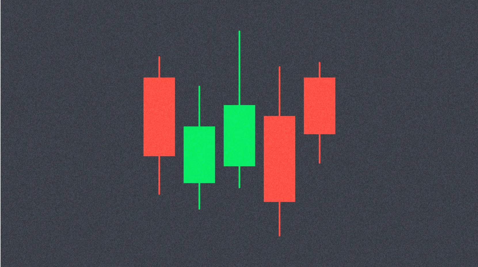
Understanding candlestick charts, developed in Japan, is essential for crypto chart analysis. Each candlestick visually presents four key data points—open, high, low, and close—for a specific time period.
The thick part of the candle is the “body,” showing the relationship between open and close. The lines above and below are “wicks” or “shadows,” representing highs and lows for the period. A white (or green) body signals a bullish candle (close above open); a black (or red) body signals a bearish candle (close below open).
Candlesticks form many different patterns and signals. A long body indicates a strong trend; a short body reflects indecision. A long upper wick signals fading upward momentum, while a long lower wick suggests waning downward pressure.
Combining candlestick patterns with technical indicators improves price direction analysis. Integrating multiple methods is crucial for effective crypto trading.
Timeframes
Choosing the right timeframe is critical for crypto chart analysis. Markets look very different depending on the timeframe, and indicator signals can vary in meaning accordingly.
Most charting platforms support timeframes from one second to one month. The best timeframe depends on your trading style.
Scalpers operate on very short timeframes—seconds to minutes—using charts of one minute or less. They seek to profit from small price moves.
Day traders aim to complete trades within a single day, favoring 15-minute, 1-hour, and 4-hour charts. These timeframes are ideal for tracking intraday price action.
Swing and position traders (medium- and long-term investors) focus on daily, weekly, or monthly charts. These timeframes help identify major trends and support long-term investment decisions.
Analyzing multiple timeframes together provides a more complete market picture. For example, you might confirm the overall trend on the long-term chart and look for entry points on a short-term chart.
Crypto Chart Patterns
Certain patterns repeat on crypto price charts and offer clues for forecasting future market direction. Recognizing and understanding these patterns makes it easier to anticipate what’s next.
Reversal Patterns
Reversal patterns suggest a possible change in trend direction. Main reversal patterns include:
Head and Shoulders: A classic pattern marking the end of an uptrend, forming three peaks (left shoulder, head, right shoulder). The inverse pattern signals the end of a downtrend.
Cup and Handle: A bullish continuation pattern, with a cup-shaped bottom followed by a brief consolidation (handle) before the uptrend resumes.
Double Top / Double Bottom: Price reverses twice at the same level, strongly indicating a trend change.
Rising and Falling Wedge: Patterns formed by two converging trendlines, often signaling trend reversals.
Continuation Patterns
Continuation patterns indicate that after a brief consolidation, the original trend is likely to resume.
Pennant: A short-term triangle that forms after a sharp price move, signaling trend continuation.
Rectangle (Box): Price moves sideways within a fixed range, with the breakout direction dictating trend resumption.
Flag: After a sharp move, price consolidates between two parallel lines before returning to the prior trend.
Bilateral Patterns
Bilateral patterns suggest price could move in either direction.
Symmetrical Triangle: Formed by two converging trendlines, with breakout direction uncertain.
Ascending and Descending Triangle: One horizontal and one sloping trendline; these patterns provide some prediction for breakout direction.
How to Judge Trends
These are the key concepts for determining if a trend will reverse or continue:
Higher Highs, Higher Lows: Price sets new highs with each move, and the lows are also higher. This is a bullish sign of a healthy uptrend.
Lower Highs, Lower Lows: Price fails to establish new highs and sets lower lows. This is a bearish sign of a continuing downtrend.
Divergence: When price action and technical indicators move out of sync. For example, if price makes a new high but the RSI does not, trend momentum is likely weakening, and the chance of a reversal rises.
Top Resources for Crypto Chart Analysis
To improve your crypto charting skills, it is essential to leverage the right educational resources and tools. Here are some valuable sources for traders:
TradingView: Used by traders worldwide, this platform offers comprehensive charting tools and technical indicators—even in the free version. It supports all skill levels and has strong community features for sharing and reviewing analysis.
BabyPips: A leading educational resource for technical analysis, covering everything from basics to advanced strategies. Originally a forex site, its principles apply broadly to crypto. The “School” section offers step-by-step learning for beginners.
Twitter (X): Following top analysts and industry leaders gives you real-time market insights and updates. Always vet the reliability of information and cross-check multiple sources.
BeInCrypto: A respected crypto media outlet offering in-depth technical analysis and educational content—ideal for ongoing learning.
By using these resources and gaining hands-on trading experience, your charting skills will steadily improve. However, no method is 100% foolproof, so robust risk management is always essential for success.
FAQ
What are the basics of reading crypto charts? What is a K-line?
K-line charts display price open, high, low, and close as bars. Bullish candles (green) indicate rising prices, while bearish candles (red) show falling prices. The height of the candle signals trading volume and price movement—crucial for trend analysis.
How do you identify trends on crypto trading charts? How do you distinguish uptrends from downtrends?
An uptrend features successively higher highs and lows, with the 50-day moving average above the 200-day average. In a downtrend, highs and lows decline, and the moving averages reverse. Rising trading volume also confirms a strong trend.
How do you use technical indicators like moving averages (MA), RSI, and MACD?
Moving averages (MA) reveal trend direction; RSI measures overbought or oversold conditions; MACD detects trend reversals. Combining these tools enables more accurate market analysis and timing of trades.
How do you identify support and resistance levels on crypto charts?
Support levels are price zones where buying interest is concentrated—visible as clusters of buy orders on depth charts. Resistance levels mark price ceilings from concentrated sell orders. Identify these using historical highs/lows and technical analysis.
How do chart patterns (triangles, double tops, etc.) help in trading?
Chart patterns provide trading signals and help forecast trend reversals. Triangles signal consolidation, while double tops indicate a possible downtrend. Recognizing these patterns helps you anticipate price moves and optimize your trading strategies.
Does chart analysis differ between short-term trading (day trading) and long-term investing?
Yes, there are major differences. Short-term trading relies on technical analysis of short-term price and volume trends; long-term investing focuses on long-term price trends and fundamental value. Short-term traders track minute-by-minute moves; long-term investors analyze monthly or longer-term trends.
* The information is not intended to be and does not constitute financial advice or any other recommendation of any sort offered or endorsed by Gate.