Master candlestick chart analysis for cryptocurrencies and sharpen your trading skills. Explore beginner-friendly tools and patterns, and apply technical analysis with Japanese candlesticks for optimal results. Start trading on Gate to elevate your strategy.
Beginner's Guide to Candlestick Charts
Introduction
For newcomers to trading or investing, chart reading can feel daunting. Many rely on intuition, making investment decisions based on gut feelings. However, trading and investing are fundamentally about probabilities and risk management. The ability to read and interpret candlestick charts—commonly called candlesticks—is crucial for nearly every investment style. This skill empowers traders to make informed decisions grounded in rigorous technical analysis.
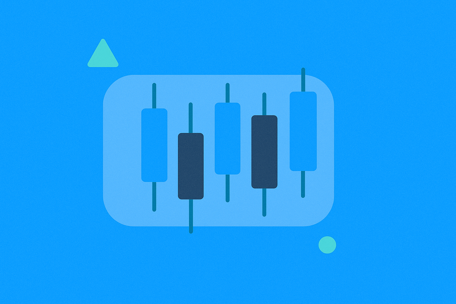
What is a candlestick?
A candlestick chart is a financial chart that visually displays an asset's price movements over a specific time interval. Each candle corresponds to the same time frame, offering a clear and systematic view of price action. Candlesticks can represent any time period, ranging from seconds to years, making them exceptionally versatile for various types of analysis.
The origins of candlestick charts date back to the seventeenth century, when they were first used in financial markets. The invention is widely credited to the Japanese rice trader Homma, who saw the value of this visual format for analyzing price trends. Although candlestick charts can be used for any data analysis, their primary application is in financial markets, where their ability to highlight behavioral patterns is indispensable.
How do candlestick charts work?
Each candle is built from four essential price points: the Open (the first trading price during the interval), the High (the highest price in that interval), the Low (the lowest price), and the Close (the final price before the interval ends).
A candle’s visual structure has two main parts. The range between the open and close is the "body," representing net price movement for the period. The lines extending from the body to the high and low—called "wicks" or "shadows"—show the full range of price movement. This structure instantly communicates both the dominant price direction and volatility for the chosen interval.
How do you read candlestick charts?
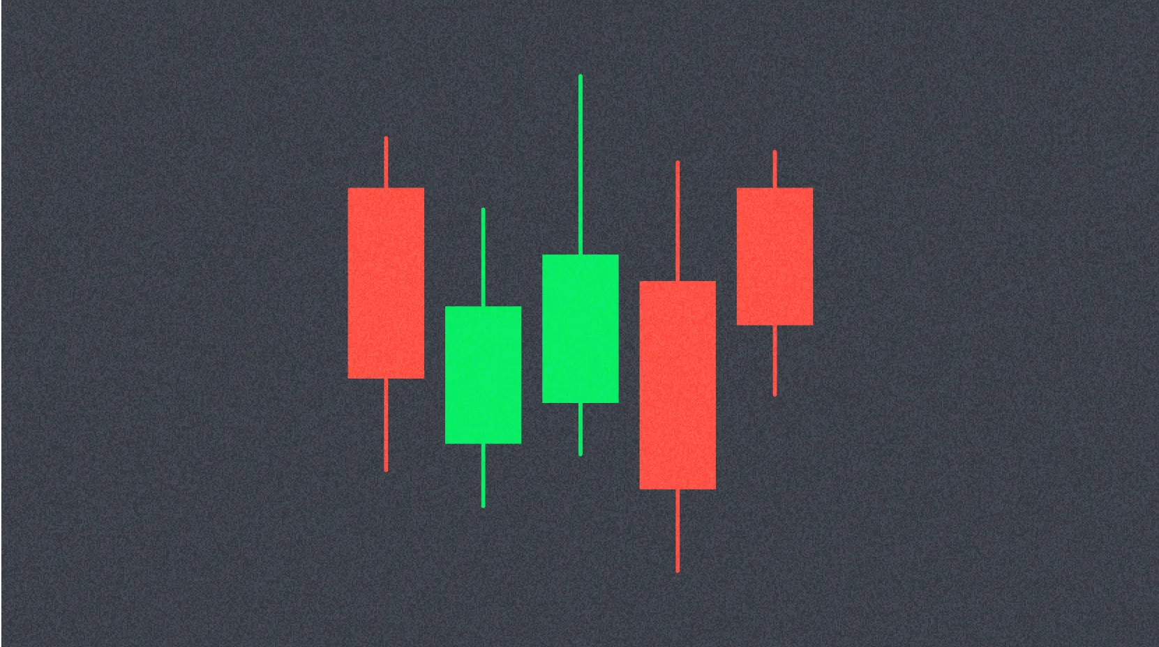
Many traders find candlestick charts easier to interpret than traditional bar or line charts. Every candle illustrates the ongoing contest between bulls (buyers) and bears (sellers) during a set time frame. The length of the candle’s body reveals the intensity of this struggle—the longer the body, the greater the buying or selling pressure during that period. A long body signals a significant difference between open and close prices.
The candle’s color is also key. A green body means the asset closed higher than it opened, indicating upward or bullish movement for the interval. A red body means the price fell, indicating a bearish move. Short wicks suggest that the high or low was near the closing price, indicating greater stability at price extremes.
What candlestick charts don’t show
Despite their advantages, candlestick charts have important limitations traders should recognize. Candles don’t reveal what happened between the open and close; they only show the net difference. For instance, while the wicks mark the period’s high and low, they don’t indicate which came first or the sequence of intraperiod price movements.
Another limitation is market noise—especially on lower time frames, candlestick charts can display a lot of noise, creating false or misleading signals. If traders don’t analyze these charts alongside other technical indicators, this noise may lead to poor decisions.
Heikin-Ashi Candles
Heikin-Ashi, meaning "average bar" in Japanese, is a refined version of standard candlestick charts. These charts use a modified mathematical formula based on average prices, smoothing out price action for clearer analysis. Heikin-Ashi’s main purpose is to filter out market noise and reveal more reliable trends.
Traders often combine Heikin-Ashi candles with traditional candlesticks to avoid false signals and confirm genuine patterns. Interpretation is specific: green Heikin-Ashi candles without lower wicks typically signal a strong, sustained uptrend, while red candles without upper wicks indicate a strong, established downtrend. Using both tools together gives traders a clearer, more dependable view of market direction.
Conclusion
Candlestick charts are among the most essential tools for any trader or investor aiming for success in the financial markets. They offer a clear, effective visual representation of price action and the flexibility to analyze data across any time frame, from intraday trades to long-term trends. Mastering chart reading, candlestick patterns, and technical setups—combined with a disciplined analytical approach and consistent practice—can give traders a distinct edge. Proficiency with candlestick charts is the foundational step toward building a successful, sustainable trading strategy.
FAQ
What is a candlestick?
A candlestick is a chart that displays the open, close, high, and low prices for a specific period. It visually tracks an asset’s price changes and helps traders spot market trends and patterns.
What does "candle" mean?
In crypto, "candle" translates to "vela." It refers to a chart that displays open, close, high, and low prices for a given time period. Traders use it to analyze market trends.
What are the main components of a candlestick (wick, body, open, close)?
A candlestick consists of four elements: the body (range between open and close), upper wick (high), and lower wick (low). A filled body means the close is higher than the open; an empty body means the opposite.
How do you interpret a bullish versus bearish candlestick?
A bullish candlestick has the close above the open with a green body, signaling buying pressure. A bearish candlestick has the close below the open with a red body, reflecting selling pressure. The shadows show the high and low for the period.
Which candlestick patterns are most important for technical analysis?
The key patterns are Doji, Hammer, Engulfing, Head and Shoulders, and Triangles. These patterns highlight shifts in buying or selling pressure and signal likely market direction.
* The information is not intended to be and does not constitute financial advice or any other recommendation of any sort offered or endorsed by Gate.