This beginner's guide provides a comprehensive overview of candlestick charts in cryptocurrency trading, a fundamental technical analysis tool used on platforms like Gate. The article covers essential elements including timeframes, chart axes, candle bodies, and wicks, alongside common patterns such as Doji, Morning Star, and Evening Star. Readers will learn how to identify bullish and bearish patterns, including Hammers, Engulfing patterns, and Three Soldiers/Crows formations. The guide emphasizes reading candlestick charts by identifying trends, recognizing patterns, analyzing volume, and locating support-resistance levels. Integration with moving averages, RSI, Fibonacci retracement, and volume indicators enhances trading accuracy. Critical sections address common mistakes—over-reliance on patterns, neglecting stop-loss orders, poor risk management, and ignoring market trends—ensuring traders develop disciplined, comprehensive strategies for cryptocurrency market success.
The Significance of Candlestick Charts in Cryptocurrency Trading
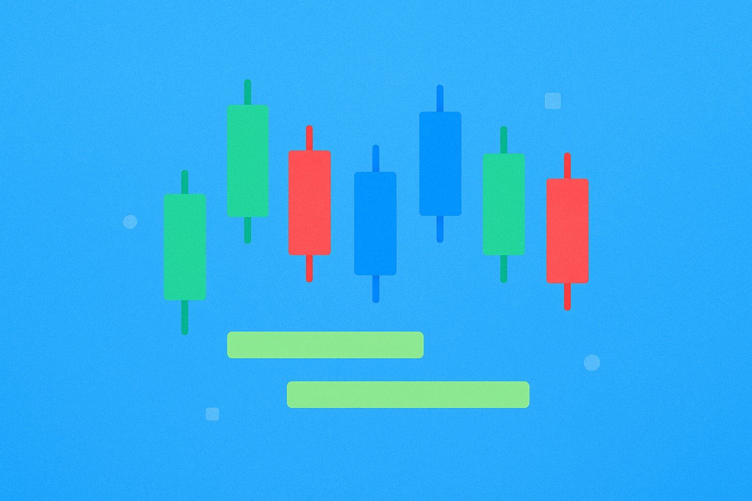
Candlestick charts represent one of the most popular types of financial charts utilized by traders to analyze price movements across various markets, including the cryptocurrency market. Originally developed by Japanese rice traders in the 18th century, these charts have become a fundamental tool for technical analysis worldwide.
Candlestick charts provide a visual representation of price movements over a specific time period. Each candle on the chart represents a defined timeframe, such as one hour or one day. The body of the candle displays the opening and closing prices, while the wicks or shadows indicate the high and low prices during that period. By analyzing candlestick charts, traders can identify trends, support and resistance levels, and potential trend reversal patterns.
In the volatile and rapidly changing world of cryptocurrency trading, effective analytical tools are essential for understanding market movements and trends. Candlestick charts are particularly valuable in crypto trading because they offer a clear visual representation of price action, making it easier to identify patterns and make informed trading decisions. These charts can indicate whether the current price trend is bullish or bearish, and whether the trend is strengthening or weakening.
Moreover, candlestick charts help traders identify key support and resistance levels, which are crucial for setting Stop Loss and Take Profit orders. This capability enables traders to manage risk effectively and protect their capital in the highly unpredictable cryptocurrency markets.
Elements of a Candlestick Chart
Timeframes
Candlestick charts display price movements within a specified time interval, which can range from minutes to months. The chosen timeframe depends on the trader's preferences and the trading strategy being employed. Day traders might prefer shorter timeframes like 5-minute or 15-minute charts, while swing traders and position traders typically analyze daily or weekly charts to identify longer-term trends.
X-Axis
The x-axis of a candlestick chart represents the analyzed time period. Each candle corresponds to a specific duration, such as an hour, day, or week. This horizontal axis allows traders to track price evolution over time and identify temporal patterns in market behavior.
Y-Axis
The y-axis of a candlestick chart represents the price range for the given timeframe. The range is typically displayed in dollars, euros, or another currency. This vertical axis enables traders to quickly assess the magnitude of price movements and compare different price levels across the chart.
Body
The body of the candle represents the opening and closing prices for the given time period. The color of the body indicates whether the period was bullish or bearish. A green or white body indicates an upward trend, meaning the closing price was higher than the opening price. Conversely, a red or black body indicates a downward trend, where the closing price was lower than the opening price. The size of the body reflects the strength of the price movement during that period.
Wicks
Wicks, also known as shadows or tails, represent the highest and lowest prices reached during the given period. The length of the wick indicates the price range for that period and provides insight into market volatility and the strength of buying or selling pressure. Long upper wicks suggest that buyers pushed prices higher but sellers eventually drove them back down, while long lower wicks indicate that sellers pushed prices lower but buyers stepped in to drive them back up.
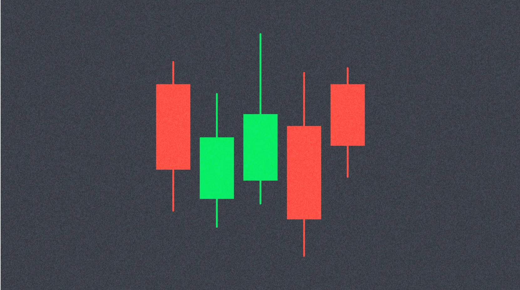
Common Candlestick Patterns
Doji
A Doji is a candle with a small body and long wicks, indicating uncertainty in the market. This pattern forms when the opening and closing prices are virtually equal, suggesting indecision between buyers and sellers. A Doji pattern can signal a potential reversal or continuation of the current trend, depending on its context within the broader price action. Traders should look for confirmation from subsequent candles before making trading decisions based on a Doji.
Morning Star
This bullish reversal pattern occurs after a downtrend and consists of three candles: a long bearish candle, a small candle with a short body and long wicks (which can be bullish or bearish), and a long bullish candle. The pattern suggests that selling pressure is exhausting and buyers are beginning to take control. The Morning Star is considered a strong reversal signal, particularly when accompanied by high trading volume on the third candle.
Evening Star
This bearish reversal pattern occurs after an uptrend and mirrors the Morning Star. It consists of three candles: a long bullish candle, a small candle with a short body and long wicks, and a long bearish candle. The Evening Star indicates that buying pressure is weakening and sellers are gaining momentum. This pattern warns traders of a potential trend reversal from bullish to bearish.
Harami
Harami patterns occur when a small candle with a short body is contained within the body of a larger preceding candle. This pattern can be either bullish or bearish depending on the context. A bullish Harami forms during a downtrend when a small bullish candle appears within a larger bearish candle, suggesting potential upward reversal. Conversely, a bearish Harami forms during an uptrend, indicating potential downward reversal. The Harami pattern reflects a pause in the current trend and possible momentum shift.
Bullish and Bearish Patterns
Bullish Patterns
Hammer
The Hammer is a bullish reversal pattern that typically appears at the bottom of a downtrend. Hammer formations are characterized by a small body and a long lower wick, indicating that buyers entered the market and pushed prices upward after an initial decline. The long lower wick shows that despite selling pressure pushing prices down, buyers were strong enough to drive prices back up near the opening level. A Hammer is most reliable when it appears after an extended downtrend and is confirmed by a subsequent bullish candle.
Bullish Engulfing
A Bullish Engulfing pattern occurs when a large bullish candle completely engulfs the body of a preceding small bearish candle. This pattern indicates that buyers have overwhelmed sellers and are pushing prices upward with strong momentum. The larger the engulfing candle relative to the previous candle, the stronger the bullish signal. This pattern is particularly significant when it appears at key support levels or after a prolonged downtrend.
Three White Soldiers
This pattern appears when three consecutive bullish candles form on the chart, each opening within the body of the previous candle and closing near its high. The Three White Soldiers pattern indicates a strong uptrend and is a powerful bullish signal. It suggests sustained buying pressure and often marks the beginning of a significant upward move. Traders should look for this pattern to appear after a period of consolidation or at the end of a downtrend for maximum reliability.
Bearish Patterns
Shooting Star
The Shooting Star is a bearish reversal pattern that appears at the top of an uptrend. This candle is characterized by a small body and a long upper wick, indicating that sellers entered the market and pushed prices downward after buyers initially drove them higher. The long upper wick demonstrates that despite buying pressure pushing prices up, sellers were strong enough to drive prices back down near the opening level. A Shooting Star is most effective when confirmed by a subsequent bearish candle.
Bearish Engulfing
A Bearish Engulfing pattern occurs when a large bearish candle completely engulfs the body of a preceding small bullish candle. This pattern indicates that sellers have overwhelmed buyers and are pushing prices downward with strong momentum. The pattern is particularly significant when it appears at key resistance levels or after a prolonged uptrend, signaling a potential trend reversal.
Three Black Crows
This pattern appears when three consecutive bearish candles form on the chart, each opening within the body of the previous candle and closing near its low. The Three Black Crows pattern indicates a strong downtrend and is a powerful bearish signal. It suggests sustained selling pressure and often marks the beginning of a significant downward move. This pattern is most reliable when it appears after a period of consolidation or at the end of an uptrend.
Reading Candlestick Charts for Trading
-
Identify the Overall Trend - The first step in reading candlestick charts is to determine the overall market trend. Are prices generally trending upward, downward, or moving sideways? Understanding the broader trend context is crucial for making informed trading decisions. Use trend lines, moving averages, or higher timeframe analysis to confirm the dominant trend direction.
-
Look for Patterns - Search for candlestick patterns on the chart that indicate trend strength or potential reversals. Bullish patterns suggest an upward trend or reversal, while bearish patterns indicate a downward trend or reversal. Pay particular attention to patterns that form at key support or resistance levels, as these tend to be more reliable.
-
Check Volume - Volume is a critical factor in determining trend strength and validating candlestick patterns. High trading volume indicates strong market participation and suggests that the trend is likely to continue. Patterns accompanied by high volume are generally more reliable than those occurring on low volume. Increasing volume during a trend confirms its strength, while decreasing volume may signal weakening momentum.
-
Identify Support and Resistance Levels - Support and resistance levels represent price zones where buying or selling pressure tends to emerge. These levels can help traders identify potential entry and exit points. Candlestick patterns forming at these levels are particularly significant and often lead to strong price reactions. Combine support and resistance analysis with candlestick patterns to improve trading accuracy.
Combining Candlestick Patterns with Other Technical Indicators
While candlestick patterns are a powerful analytical tool, they should be used in combination with other technical indicators to increase trading accuracy and reduce false signals.
Moving Averages
Moving averages are used to smooth price data and identify trends by calculating the average price over a specific period. By combining moving averages with candlestick patterns, traders can confirm potential entry and exit points. For example, a bullish candlestick pattern forming above a rising moving average provides stronger confirmation of an uptrend. Common moving averages include the 50-day and 200-day moving averages for longer-term analysis, and the 20-day moving average for shorter-term trading.
The RSI is an oscillator that measures the strength and momentum of a trend on a scale from 0 to 100. Values above 70 indicate overbought conditions, while values below 30 suggest oversold conditions. By combining RSI with candlestick patterns, traders can identify potential reversal points. For instance, a bullish reversal pattern forming when RSI is below 30 provides stronger confirmation of a potential upward move.
Fibonacci Retracement
Fibonacci retracement levels are used to identify potential support and resistance levels based on the mathematical relationships discovered by Leonardo Fibonacci. These levels (typically 23.6%, 38.2%, 50%, 61.8%, and 78.6%) help traders identify where price corrections might end and the trend might resume. Candlestick reversal patterns forming at key Fibonacci levels provide high-probability trading opportunities.
Volume Indicators
Volume indicators provide valuable insight into trend strength and market participation. By combining volume indicators with candlestick patterns, traders can confirm potential entry and exit points and assess the reliability of price movements. Popular volume indicators include On-Balance Volume (OBV), Volume Weighted Average Price (VWAP), and Accumulation/Distribution Line. Increasing volume during pattern formation strengthens the signal's reliability.
Common Mistakes to Avoid
-
Over-reliance on Candlestick Patterns - Candlestick patterns are just one analytical tool among many. Relying solely on candlestick patterns while ignoring other technical indicators, fundamental analysis, and market context can lead to inaccurate predictions and poor trading decisions. Always use a comprehensive approach that incorporates multiple analytical methods.
-
Not Using Stop-Loss Orders - Stop-loss orders are essential for limiting losses and protecting trading capital. Failing to use stop-loss orders can result in significant losses, especially in the volatile cryptocurrency markets where prices can move dramatically in short periods. Always determine your stop-loss level before entering a trade and stick to it.
-
Lack of Proper Risk Management - Effective risk management is fundamental to long-term trading success. Never risk more than you can afford to lose, and always maintain a disciplined approach to position sizing. A common rule is to risk no more than 1-2% of your trading capital on any single trade. Develop a comprehensive risk management plan that includes position sizing, stop-loss placement, and portfolio diversification.
-
Ignoring Market Trends - Trading against the dominant market trend is one of the most common mistakes traders make. It's essential to pay attention to overall market trends and use them to inform your trading strategy. The saying "the trend is your friend" exists for good reason – trading with the trend significantly increases your probability of success.
Summary
Candlestick charts are a powerful tool for analyzing market trends and making informed trading decisions in cryptocurrency markets. By identifying common candlestick patterns and using candlestick charts in combination with other technical indicators and market analysis, traders can gain valuable insights into market dynamics and develop effective trading strategies.
However, it's important to remember that no single indicator or tool can guarantee trading success. Proper risk management, discipline, and continuous learning and improvement are essential for successful trading. Understanding candlestick patterns is just the beginning – mastering their application in real market conditions requires practice, patience, and experience.
By avoiding common mistakes such as over-reliance on patterns alone, neglecting stop-loss orders, poor risk management, and ignoring broader market trends, you can increase your chances of success and achieve your trading goals. Combine candlestick analysis with comprehensive market research, sound money management principles, and emotional discipline to develop a robust trading approach that can withstand the challenges of cryptocurrency markets.
FAQ
What is a candlestick chart (K-line chart) and what are its basic components?
A candlestick chart visually displays price movements with four key components: opening price, closing price, highest price, and lowest price within a time period. The rectangular body shows the open-close range, while wicks extend to show highs and lows. Color indicates direction: typically green for price increases and red for decreases.
How to interpret opening price, closing price, highest price, and lowest price in candlestick charts?
Opening price is where the candle starts, closing price where it ends. Highest price is the peak reached during the period, lowest price is the bottom. The body shows open-close range, while wicks extend to highs and lows, revealing price volatility and market sentiment.
What are common candlestick patterns and what market signals do they represent?
Common patterns include hammer(reversal signal), shooting star(bearish signal), engulfing(trend reversal), doji(indecision), and morning star(bullish reversal). Each pattern reflects trader sentiment and potential price direction changes based on open, close, high, and low prices.
How to identify support and resistance levels for cryptocurrency trading decisions?
Identify support levels where price bounces upward and resistance levels where price reverses downward. Use candlestick patterns, previous highs/lows, and moving averages. When price approaches support, it may rally; at resistance, it may decline. These levels guide entry and exit points for strategic trading decisions.
How do timeframes (1-minute, 1-hour, 1-day) in candlestick charts affect trading strategy?
Short timeframes (1-minute, 1-hour) suit scalping and day trading with frequent entries. Longer timeframes (1-day, weekly) identify major trends for swing trading. Shorter timeframes show more volatility and noise; longer ones reveal sustained price movements. Match timeframe to your trading style and risk tolerance.
How to combine candlestick charts with other technical indicators such as moving averages and RSI to confirm trading signals?
Combine candlestick patterns with moving averages to identify trend direction and support/resistance levels. Use RSI to confirm overbought or oversold conditions. When candlestick breakouts align with moving average crossovers and RSI extremes, it strengthens signal reliability and improves entry and exit timing accuracy.
What risks should be noted when trading cryptocurrencies using candlestick charts in the crypto market?
Key risks include rapid price volatility causing sudden losses, false signals from chart patterns during low trading volume, emotional decision-making leading to poor trades, and leverage amplifying both gains and losses. Candlestick charts also lag real-time market movements, and inexperienced traders may misinterpret complex patterns, resulting in significant financial exposure.
* The information is not intended to be and does not constitute financial advice or any other recommendation of any sort offered or endorsed by Gate.