A comprehensive introduction to cryptocurrency charting for beginners. Explore foundational concepts like candlestick charts, moving averages, and support and resistance levels, along with practical techniques for using technical indicators—including RSI, MACD, and Fibonacci analysis. Build your chart analysis expertise on platforms such as Gate and set the stage for successful trading.
The Importance of Cryptocurrency Chart Analysis
Cryptocurrency trading is one of the most common ways to earn returns from digital assets, but success requires specialized knowledge and technical skills. The cryptocurrency market is inherently volatile, with dramatic price swings. Compared to traditional forex or equity markets, this environment is far more dynamic and challenging to predict.
The ability to accurately interpret charts for Bitcoin and other cryptocurrencies gives traders a distinct competitive advantage. By mastering chart analysis, traders can make sharper decisions about when to enter and exit trades, significantly boosting their potential profitability.
Market analysis generally follows two main approaches. Fundamental analysis evaluates external factors—news, economic events, industry trends, and the regulatory climate. Technical analysis, on the other hand, uses price charts and mathematical indicators to forecast future price movements. This article focuses on technical analysis for cryptocurrency charts, providing an in-depth look at practical methods for analyzing Bitcoin (BTC) and similar digital assets.
What Is Technical Analysis?
Technical Analysis (TA) is a systematic approach that predicts future market trends by analyzing historical price and volume data. The core of this method lies in identifying market trends, support and resistance levels, and momentum using price charts.
Technical analysis is based on the premise that market prices move in recognizable patterns—patterns that reflect the collective psychology of market participants. Human behavior tends to follow certain tendencies, so investors often react similarly in comparable market scenarios. This psychological regularity appears visually as chart patterns.
It's important to understand that technical analysis does not assess the fundamental value or long-term prospects of cryptocurrencies. Rather, it leverages mathematical indicators and established chart patterns to statistically estimate the likelihood of specific price movements. By mastering technical analysis, traders can enter markets with greater confidence and exit at optimal moments to minimize risk.
Bull (Buying Pressure) vs. Bear (Selling Pressure)
Cryptocurrency market prices move in three main directions: uptrend, downtrend, and sideways trend. An uptrend is called a "bull market," where buying pressure exceeds selling pressure. A downtrend is a "bear market," dominated by selling pressure. Sideways movement is known as a "range market" or "consolidation phase."
From a psychological perspective, prices tend to follow the prevailing trend, and trend-following behavior is much more common than countertrend moves. In crypto markets, long-term trends are relatively stable, and once established, they can persist for months or even years.
Bitcoin bull and bear markets often last for extended periods until a clear reversal occurs. Historically, Bitcoin bull markets have spanned two to three years, followed by a correction phase before starting a new cycle.
However, price trends are rarely linear. Major trends often include temporary reversals or periods of consolidation. These short-term fluctuations can generate false signals of trend reversal, so it is crucial to analyze charts on multiple timeframes to distinguish genuine trend changes from brief corrections.
Moving Averages
Moving averages are among the most fundamental and essential technical indicators in cryptocurrency chart analysis. Their main purpose is to smooth short-term price noise and clarify the underlying market trend visually.
Cryptocurrency trading typically uses two main types of moving averages:
Simple Moving Average (SMA): Calculates the arithmetic average of closing prices over a specified period. For example, the 50-day SMA sums the past 50 days' closing prices and divides by 50. While straightforward and easy to interpret, it gives equal weight to all data, so it tends to lag behind recent price changes.
Exponential Moving Average (EMA): This weighted average emphasizes more recent price data, making it more responsive to current market conditions and better at detecting trend reversals early. Many active traders prefer EMA for its quick reaction to price movements.
The most widely used moving averages in crypto are the 50-day and 200-day lines. These help identify long-term trend direction and key support and resistance levels.
Moving average crossovers are viewed as critical signals of market trend reversal:
Golden Cross: Occurs when the 50-day moving average crosses above the 200-day moving average. This is a powerful indicator of a shift to a bullish trend, prompting many traders to consider long positions. Historically, Bitcoin golden crosses have often signaled the beginning of major bull markets.
Death Cross: Occurs when the 50-day moving average crosses below the 200-day moving average. This signals a shift to a bearish trend, often prompting traders to review holdings or take profits for risk management.
Moving averages also function as dynamic support and resistance levels. In uptrends, prices tend to rebound near moving averages, which act as support. In downtrends, moving averages serve as resistance, limiting price rallies.
Support and Resistance Levels
Support and resistance are foundational concepts in crypto chart analysis. They represent psychological price levels for market participants and are essential for predicting turning points in price action.
**Support levels** are price zones where rebounds are expected during a decline. At these levels, buying pressure outweighs selling pressure, causing downward movement to pause or reverse. Support forms because many traders see the price as "undervalued" and place buy orders.
**Resistance levels** are price zones where upward momentum stalls during a rally. Here, selling pressure overtakes buying, so price increases pause or reverse. Resistance typically forms when traders take profits or investors who bought higher sell to avoid losses.
When prices repeatedly bounce or reverse at the same level, that support or resistance is considered "strong." The more frequent the reactions, the more significant the level.
Breakout occurs when price decisively moves through these key levels. Breaking down below support or breaking out above resistance often marks the start of a new trend. Importantly, after a breakout, resistance often becomes new support (or vice versa)—a "role reversal" seen frequently in markets.
Identifying support and resistance accurately lets traders set precise entry and exit points, sharply improving risk management.
Fibonacci Analysis
Fibonacci retracement is a highly valuable analysis tool for crypto traders. It's based on a number sequence discovered by 13th-century Italian mathematician Leonardo Fibonacci. The Fibonacci sequence reflects the golden ratio seen in nature and, remarkably, is applicable to financial market price behavior.
The main ratios used in Fibonacci analysis are 0.236 (23.6%), 0.382 (38.2%), 0.500 (50%), 0.618 (61.8%), and 0.764 (76.4%). These help predict how far prices may retrace during corrections after major moves.
The basic principle is that after a strong price move in one direction, prices typically retrace a certain proportion of that distance before resuming the original trend.
In practice: For an uptrend, draw the Fibonacci tool from the most recent low to high. This places several horizontal lines on the chart, marking potential support levels. Many traders focus on the 38.2%, 50%, and 61.8% retracement levels, planning to buy at these zones if prices rebound.
In a downtrend, draw from the most recent high to low; the resulting levels act as potential resistance.
Fibonacci analysis is especially powerful when combined with other technical indicators. For instance, price zones where Fibonacci levels overlap with moving averages or previous support/resistance lines are often key turning points.
Other Technical Indicators
In addition to moving averages and Fibonacci analysis, cryptocurrency chart analysis uses a range of technical indicators. Each has unique features and applications, and combining them allows for more comprehensive market insights.
RSI (Relative Strength Index): RSI measures market overheating on a scale from 0 to 100. RSI of 30 or below indicates "oversold," while 70 or above means "overbought." In crypto, prices often reverse after extreme RSI readings, making it useful for contrarian strategies. However, strong trends can keep RSI extreme for long periods, so it's best used with other tools.
MACD (Moving Average Convergence Divergence): MACD combines several moving averages to assess both trend direction and strength. Crossovers of the MACD and signal lines are buy/sell signals. The MACD histogram visualizes momentum shifts early. Crypto traders especially value MACD for spotting medium-term trend reversals.
Stochastics: This momentum oscillator shows where the closing price sits within a recent price range. Like RSI, it helps identify overbought and oversold conditions. Stochastics are especially useful for short-term trades, helping pinpoint entry and exit timing.
Parabolic SAR: Dots appear above or below candlesticks to indicate trend direction. Dots below signal uptrends; dots above mean downtrends. A shift in dot position signals a possible trend reversal. Parabolic SAR is often used in trend-following strategies to dynamically set stop-loss levels.
Bollinger Bands: These bands are plotted above and below a moving average using standard deviation. Bands widen during volatile periods and narrow when volatility is low. Prices near the upper band suggest overbought conditions; near the lower band suggest oversold. Band narrowing often precedes major price moves, so Bollinger Bands are useful for anticipating breakouts.
Other advanced tools include Ichimoku Cloud, Average Directional Index (ADX), and Chaikin Oscillator. The key is to use multiple indicators for a holistic market analysis, not rely solely on any single tool.
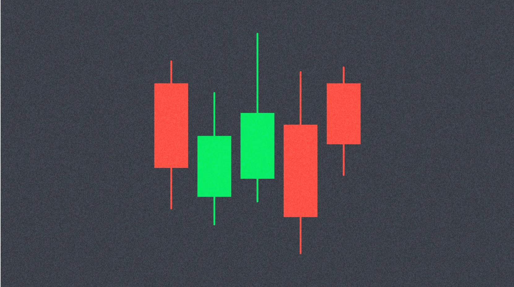
Candlestick Charts
Developed in Japan, candlestick charts are the most widely used price display method in crypto trading. Candlesticks are more than just price displays—they visually capture market psychology and supply-demand dynamics.
Each candlestick shows four critical prices for a given period: open, high, low, and close. The thick "body" represents the range between open and close. Thin lines called "wicks" or "shadows" show the highest and lowest prices reached.
Body color reveals price direction. Typically, a close above the open is a bullish candle (green or white); a close below the open is bearish (red or black).
Candlestick patterns can be single-candle or multi-candle signals. For example, a candle with a long lower wick means prices dropped sharply but buyers pushed them back up—a bullish signal.
Classic candlestick patterns include the "hammer," "inverted hammer," "doji," "engulfing," "morning star," and "evening star," each reflecting specific market psychology and likely price direction.
Candlestick analysis is most powerful when combined with other technical indicators or support/resistance levels. For instance, a bullish candlestick pattern near key support sharply increases the probability of a price reversal.
Timeframes
Timeframe selection is vital in crypto chart analysis. The same asset can look entirely different depending on the chosen timeframe, so matching your trading style to the right timeframe is essential for success.
Most charting tools support a range of timeframes, from 1-minute to monthly charts. Each has unique features and applications.
Short-Term Timeframes (1–15 minutes): Used by scalpers and day traders. These show rapid price changes and high noise, requiring fast decision-making and execution. Short-term traders aim to profit from small price movements.
Medium-Term Timeframes (1–4 hours): Ideal for swing traders. Short-term noise is reduced, making trends and patterns clearer. Many active traders base decisions on these timeframes.
Long-Term Timeframes (Daily–Monthly): Used by position traders and long-term investors. These reveal major market trends and critical turning points. Long-term investors focus on large-scale trends and avoid being distracted by short-term volatility.
Multi-timeframe analysis is critical. For example, confirm an uptrend on the daily chart, identify a pullback on the 4-hour chart, and pinpoint entries on the 15-minute chart—a layered approach that is highly effective.
This method enables precise position building without losing sight of the overall trend. By analyzing different timeframes together, you get a multidimensional view of the market and can make more accurate trading decisions.
Cryptocurrency Chart Patterns
Crypto charts feature recurring, recognizable patterns. Identifying these patterns offers clues for forecasting future price movements. Chart patterns visualize the collective psychology of market participants and are proven, reliable analytic tools.
Reversal Patterns
Reversal patterns signal the end of an existing trend and the start of a new one in the opposite direction.
Head and Shoulders: A bearish reversal pattern seen at the end of an uptrend. It has three peaks—the middle (head) is highest, the sides (shoulders) are similar height. The pattern completes when price breaks below the neckline, confirming a shift to a downtrend.
Inverse Head and Shoulders: A bullish reversal pattern at the end of a downtrend, shaped like an upside-down head and shoulders. A breakout above the neckline signals transition to an uptrend.
Double Top / Double Bottom: Price reverses twice at the same level. Double tops are bearish signals; double bottoms are bullish. The pattern confirms when price breaks through the valley (or peak) between the two highs (or lows).
Cup and Handle: A long-term bullish pattern with a U-shaped base (cup) followed by a short consolidation (handle). A breakout above the handle often signals a major rally.
Continuation Patterns
Continuation patterns signal that, after a brief pause, the existing trend will resume.
Flag: Features a sharp price move (flagpole) followed by consolidation in a narrow range. After the pause, prices tend to break out in the original trend direction.
Pennant: Similar to a flag, but consolidation forms a converging triangle. Breakouts typically happen at the end of the convergence.
Rectangle: Price moves sideways between clear support and resistance. Breaking out of either side signals a new trend.
Neutral Patterns
Symmetrical Triangle: Formed by descending highs and ascending lows; can break out either way, with direction setting the next trend.
Ascending/Descending Triangle: Ascending triangles have horizontal resistance and rising support—bullish breakout likely. Descending triangles are the opposite and tend to break bearish.
Trend Continuation Criteria
Higher Highs, Higher Lows: Price continues to set new highs and each pullback stays above the previous low—a sign of a healthy uptrend.
Lower Highs, Lower Lows: Price fails to reach previous highs and each low goes lower, signaling a sustained downtrend.
Divergence: Price and technical indicators move in opposite directions. For example, price hits a new high but RSI does not—momentum is weakening, and reversal risk increases.
Understanding and using these chart patterns in trading can boost your odds of profit. Remember, patterns are not guarantees—they are tools to improve your probability of success.
FAQ
What are the fundamentals of reading cryptocurrency trading charts?
Use candlesticks to visualize price movements and moving averages to assess trend direction. Support and resistance levels indicate psychological price zones; combining these elements helps analyze changes in trading volume.
Candlesticks show open, close, high, and low prices for a given period. Red (bullish) candles indicate closes above opens; black (bearish) candles indicate closes below opens. Body length shows the magnitude of movement; wicks show price range. More bullish candles suggest upward momentum, while more bearish candles signal downward momentum.
How do you use technical indicators like moving averages and RSI?
Moving averages help identify price trends, and RSI gauges overbought and oversold conditions. Using multiple indicators together produces a more accurate view of trading volume changes and makes it easier to time entries and exits.
How do you read buy and sell signals from charts?
Judge buy and sell signals by closing prices. Reference changes in trading volume, moving averages, and support/resistance zones, combining closing prices with intraday movements for effective analysis.
How do you use different timeframes such as 1-minute, 1-hour, or daily charts?
Short timeframes are best for short-term trends and minor price movements; longer timeframes help reveal major trends and broad market direction. Use 1-minute charts for scalping and daily charts for swing trading, choosing based on your strategy.
How do you find support and resistance levels?
Identify support from recent lows and resistance from recent highs. Price levels that consistently trigger bounces are considered strong. Confirm by checking multiple rebound points on the chart.
* The information is not intended to be and does not constitute financial advice or any other recommendation of any sort offered or endorsed by Gate.