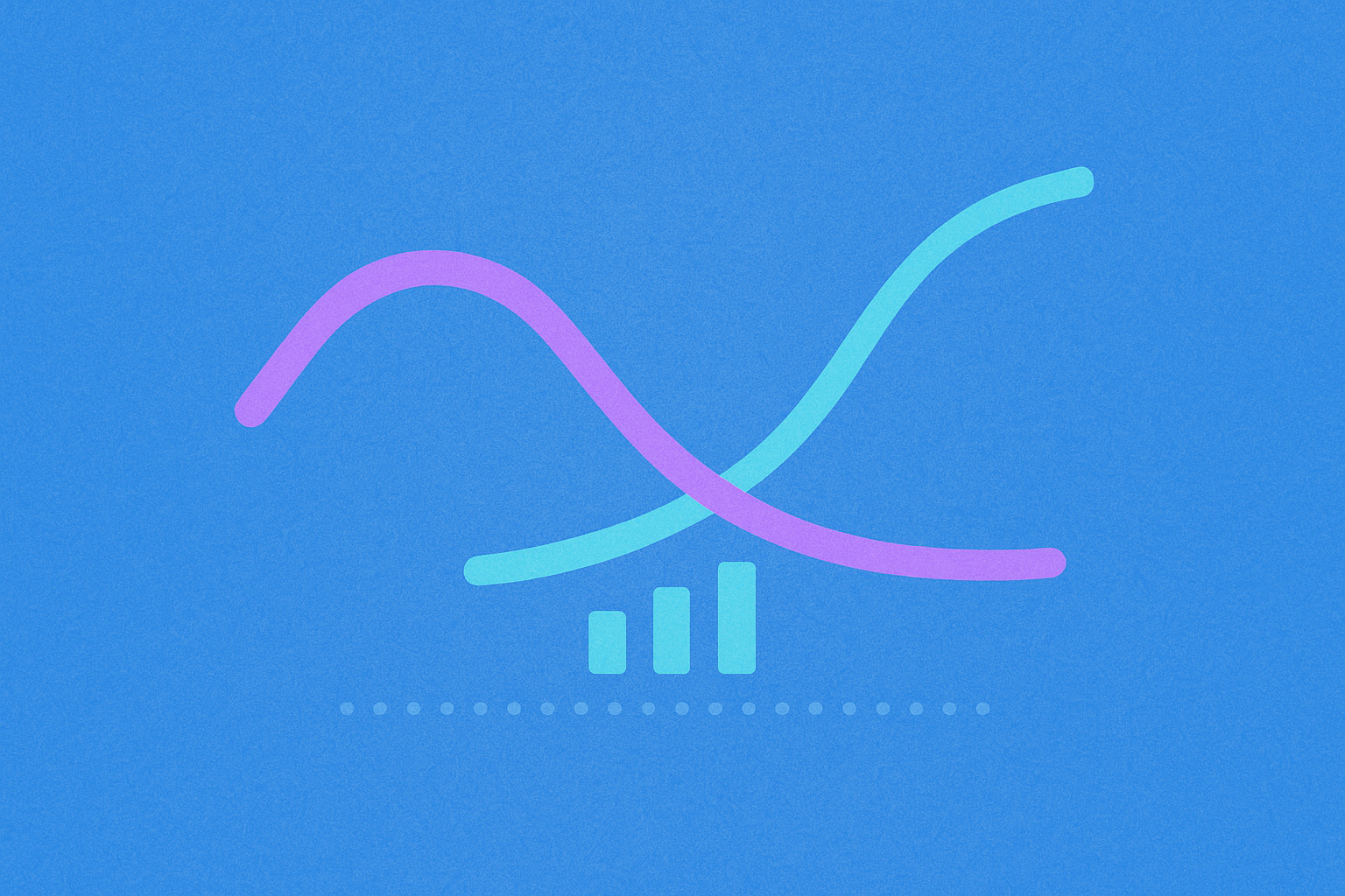
Comprehensive MACD Indicator Guide: Gain a deep understanding of this classic momentum oscillator, including its core principles, three key components, and calculation methods. Learn to identify essential trading signals such as golden and death crosses, and spot divergence setups. Discover how to use the MACD for cryptocurrency trading on Gate. The guide features hands-on examples and advanced applications like hidden divergence, empowering beginners to master technical analysis with confidence.
The Importance of Technical Analysis (TA): Decoding Market Trends with Technical Indicators
Technical analysis is an essential tool in cryptocurrency trading, designed to complement fundamental analysis. While fundamental analysis centers on evaluating a project's intrinsic value, technical analysis identifies patterns by examining historical price movements and trading volumes to forecast future price behavior. This methodology helps traders understand market cycles and develop effective trading strategies.
In practice, technical analysis depends on a range of technical indicators to guide decision-making. Numerous indicators are available, each with unique strengths and specific use cases. Knowing how each indicator works allows traders to choose the right analytical tools for varying market conditions.
Here are several widely used and practical technical indicators:
-
Exponential Moving Average (EMA): EMA smooths out price volatility and places greater emphasis on recent price changes, enabling it to capture long-term trends more responsively. Unlike the simple moving average, EMA gives the latest price data more weight, making it especially valuable in fast-moving markets.
-
Average True Range (ATR): ATR measures the strength of price volatility. For traders who actively set take-profit and stop-loss orders, ATR is a highly effective tool for establishing risk management parameters based on market volatility.
-
Bollinger Bands: Bollinger Bands are a volatility indicator based on standard deviation, using upper and lower bands to define the price range. They help traders spot potential breakout zones; a price touching or breaching a band boundary often signals that significant market movement may be imminent.
Technical Analysis Indicator: What Is MACD? A Guide to Its Three Core Components
MACD (Moving Average Convergence Divergence) is a classic momentum oscillator developed by technical analyst Gerald Appel in the 1970s. MACD enables cryptocurrency traders to identify potential trend shifts and accurately assess trend strength. Its enduring popularity comes from combining trend-following and momentum analysis, delivering multidimensional insights into market dynamics.
The MACD indicator features three primary components that work together to form a comprehensive analytical system:
MACD Line (also known as DIF)
The MACD line is the heart of the indicator, representing the difference between an asset’s 12-period and 26-period Exponential Moving Averages (EMA). This differential reveals how short-term and long-term trends interact. Since the EMA calculation prioritizes recent prices, the MACD line responds quickly to short-term price changes and is highly sensitive to shifts in market momentum. When the short-term EMA diverges upward from the long-term EMA, the MACD line rises; when it diverges downward, the MACD line falls.
Signal Line (also known as DEA)
The signal line is a 9-period EMA of the MACD line, designed to further smooth MACD’s fluctuations. This process filters out short-term noise, helping traders clearly observe overall trend changes. Crossovers between the MACD and signal lines are widely regarded as key trading signals and represent one of MACD’s most common applications.
MACD Histogram
The MACD histogram visually displays the gap between the MACD line and the signal line using bar charts. The bar height indicates the magnitude of the difference, while the bar direction (positive or negative) shows the MACD line’s position relative to the signal line. Changes in the histogram clearly express market momentum: rising bars signal growing momentum, while shrinking bars may point to weakening trend strength.
Technical Analysis Indicator: MACD Calculation | Formula and Trend Analysis
Grasping the calculation logic behind MACD is crucial for effectively interpreting the indicator. Although most trading platforms now compute MACD automatically, understanding the math helps traders better read the significance of its signals.
MACD’s calculation centers on the MACD line, defined by a straightforward formula:
MACD Line (DIF) = 12-period EMA – 26-period EMA
This formula subtracts the 26-period EMA from the 12-period EMA, making it easy to spot the degree of divergence between short- and long-term trends.
Trend Assessment Rules:
When the MACD line is positive, the 12-period EMA is above the 26-period EMA, indicating short-term strength and a bullish phase. A larger positive value means stronger upward momentum.
When the MACD line is negative, the 12-period EMA is below the 26-period EMA, signaling short-term weakness and a bearish phase. A larger negative value reflects stronger downward momentum.
MACD lines that hover near the zero axis generally suggest market consolidation, with buying and selling pressure in balance.
Technical Analysis Indicator: MACD Interpretation | Three Key Signals Every Trader Should Know
Understanding the three primary MACD signals is critical for sound trading decisions. These signals enable traders to pinpoint potential buy and sell opportunities for more effective strategies.
MACD Crossover
The MACD crossover is the most common and intuitive trading signal. When the MACD line crosses above the signal line from below (the “golden cross”), it’s viewed as bullish and suggests an upward trend may be forming—often the cue to open a long position.
Conversely, when the MACD line crosses below the signal line from above (the “death cross”), it’s seen as bearish and may signal a downtrend. Traders interpret this as a sign to exit or short the market.
Keep in mind, crossover reliability depends on market conditions. In strongly trending markets, crossovers are more accurate; in sideways markets, false signals are more frequent.
MACD Divergence
Divergence is an advanced MACD technique. When price movement and the MACD line diverge, it often warns of a coming trend reversal—an important early alert.
Bearish Divergence: If price makes new highs while the MACD line fails to do so, bearish divergence forms. This shows that, despite rising prices, momentum is fading and a reversal or pullback may be imminent—a potential sell signal.
Bullish Divergence: If price hits new lows but the MACD line does not, bullish divergence forms. This means that, even as prices drop, momentum is weakening and a rebound may be near—a possible buy signal.
Divergence signals are generally more reliable than simple crossovers, but require experience to identify and use effectively.
Zero Line Crossover
The zero line crossover is a major reference for overall trend direction. When the MACD line crosses the zero axis, the 12- and 26-period EMAs have switched places, marking a fundamental momentum shift.
When the MACD line moves above the zero axis from below, short-term momentum overtakes long-term, bullish sentiment strengthens, and an upward trend may begin—usually a medium- or long-term buy signal.
When the MACD line drops below the zero axis from above, bearish momentum builds and a downtrend may start—typically a medium- or long-term sell signal.
MACD lines above zero signal a bull market; below zero mean a bear market.
Technical Analysis Indicator: MACD Strengths and Weaknesses | Four Advantages and Three Limitations
Every technical indicator has strengths and limitations, and MACD is no exception. Understanding both aspects allows traders to use MACD more effectively and avoid over-reliance on any single tool.
Four Major Advantages of MACD
Advantage 1: Trend Identification
MACD excels at spotting and confirming market trends. By focusing on the relationship between the MACD and signal lines, traders can quickly identify whether the market is trending up or down. If the MACD remains above the signal line and both are above the zero axis during an uptrend, it’s a strong bullish indication—making MACD ideal for trend-following strategies.
Advantage 2: Momentum Visualization
The MACD histogram offers a clear view of market momentum. Changes in bar height transparently reflect shifts in trader sentiment. Growing bars—positive or negative—indicate strengthening momentum and reinforced market consensus. Shrinking bars signal possible exhaustion and the risk of a trend reversal.
Advantage 3: Intuitive Visual Representation
The MACD chart is highly intuitive. The histogram displays the gap between MACD and signal lines at a glance, letting traders quickly gauge momentum changes. Color-coding (green for positive, red for negative) further improves clarity, making it easy for beginners to assess market conditions.
Advantage 4: User-Friendly
Modern charting platforms include MACD as a built-in feature, automatically handling calculations. Traders simply add the indicator—no manual math required. This ease of use makes MACD especially friendly for beginners and lowers the technical analysis learning curve. Default parameters (12, 26, 9) are effective for most markets.
Three Major Limitations of MACD
Limitation 1: False Signals
MACD can generate false signals during volatile or sideways markets. Frequent price swings cause repeated MACD and signal line crossovers, leading to numerous buy and sell signals. If traders follow these blindly, they may suffer ongoing small losses. Always consider the broader market context when using MACD and be extra cautious in unclear trends.
Limitation 2: Lagging Nature
MACD is a lagging indicator, based on moving averages—meaning it reacts to historical price data instead of forecasting future moves. MACD signals often arrive after price changes have begun, which can result in missed entry opportunities. This lag is pronounced in fast-moving markets and may limit profit potential.
Limitation 3: No Guaranteed Profitability
Like all technical tools, MACD is just a supplemental analysis method. It helps traders spot potential setups, but can’t guarantee profits on every trade. Market prices are affected by fundamentals, sentiment, and unexpected events—any of which can disrupt indicator-based forecasts. Traders should never rely solely on MACD but integrate it into a broader analysis and risk management framework.
Technical Analysis Indicator: MACD in Action | How to Apply MACD to Trading Strategies
Reviewing real-world scenarios clarifies how to use MACD in practice. The following is a complete trading case built around the MACD indicator.
Case Background:
Suppose Bitcoin rebounds from a decline and consolidates in the $60,000–$64,000 range. During this phase, MACD generates a strong bullish signal.
Signal Identification:
During consolidation, the MACD line breaks above the zero axis—a key trend reversal signal indicating a potential bullish move. At the same time, the MACD histogram turns green and the bars keep rising, further confirming the bullish momentum. The continued growth of the histogram reveals strengthening buyer interest and upward market momentum.
Entry Strategy:
When Bitcoin trades within the $60,000–$64,000 range and MACD flashes a clear bullish signal, it’s a promising buying window. Traders can build BTC long positions within this range. To limit risk, place the stop-loss below $60,000 support, for example at $59,500—ensuring losses remain manageable if the setup fails.
Position Management:
After entry, monitor price action and MACD changes closely. In this scenario, Bitcoin breaks above the $62,000 midpoint and eventually surges past $64,000 resistance. This breakout, confirmed by bullish MACD signals, validates the trade setup.
Exit Strategy:
Once Bitcoin clears major resistance, traders can choose from two main exit approaches:
-
Take Profit: Conservative traders may sell immediately after breaking $64,000, locking in gains. This approach secures profit and guards against price reversals.
-
Trailing Stop: For greater upside, use a trailing stop. Adjust the stop higher as prices rise—such as maintaining it 5% below the peak. This lets traders capture more upside while automatically protecting profits if the price reverses.
This case demonstrates how to combine MACD signals with price action and support/resistance analysis to build a complete trading strategy. The key is to use MACD in context—together with market structure and sound risk management.
Technical Analysis Indicator: Advanced MACD Techniques | Two Types of Hidden MACD Divergence
In addition to standard MACD divergence, there are two less obvious—but equally important—hidden divergence patterns. These advanced signals typically occur during trend continuation phases and help traders distinguish between a temporary pullback and a genuine reversal. Mastering hidden divergence recognition can greatly improve your understanding of market dynamics.
Hidden Bullish Divergence
Hidden bullish divergence commonly appears during pullbacks within an uptrend. The price forms higher lows, showing that each retracement bottoms above the previous—classic uptrend behavior.
Meanwhile, the MACD histogram forms lower lows, indicating weakening momentum as prices make higher lows. This apparent contradiction tells traders that, despite the uptrend, the current pullback may be deeper or longer than it looks, as fading momentum suggests a more substantial correction.
Trading Application: Hidden bullish divergence is not a reversal signal, but rather confirms trend continuation. It signals that the current pullback is a typical correction within an uptrend, and prices will likely resume climbing once it’s over. Traders often use this pattern to add to long positions during an uptrend.
Hidden Bearish Divergence
Hidden bearish divergence is the opposite, typically showing up during rebounds in a downtrend. Prices form lower highs, indicating each rally peaks below the previous—classic downtrend structure.
Simultaneously, the MACD histogram displays higher highs, reflecting strengthening momentum during lower highs. This divergence alerts traders that, despite the downtrend, the current rebound has some force and may last longer or climb higher than expected.
Trading Application: Hidden bearish divergence also signals trend continuation, not reversal. It shows the current rebound is just a technical correction within a downtrend, and prices are likely to fall further once it ends. Traders use this pattern to identify shorting opportunities or to close long positions.
Key Identification Points:
- Hidden divergence is marked by price making “higher lows” or “lower highs” while MACD moves in the opposite direction
- Hidden divergence is mainly used to confirm trend continuation, not reversal
- Hidden divergence is usually more reliable than regular divergence because it aligns with the main trend direction
- Incorporating volume analysis can enhance hidden divergence accuracy
FAQ
What is the MACD indicator and what are its core components?
MACD is a momentum indicator consisting of the fast moving average, slow moving average, and signal line. The gap between the fast and slow MA forms the MACD line; the signal line is a moving average of the MACD. When the MACD line crosses above the signal line, it generates a buy signal; when it crosses below, it signals a sell. MACD helps traders identify trend reversal points for potential profit.
How do you use MACD to spot buy and sell signals?
When the MACD line crosses above the signal line from below, it’s a buy signal; crossing below signals a sell. A positive DIF line signals an uptrend; a negative DIF signals a downtrend. Expanding histograms indicate strengthening trends; contracting histograms indicate weakening momentum. Confirming signals with trading volume can boost accuracy.
What do MACD golden cross and death cross mean?
The golden cross happens when the fast line crosses above the slow line, signaling a buy and likely price increase. The death cross is when the fast line crosses below the slow line, signaling a sell and possible decline. These are MACD’s most important trading signals.
How does MACD behave across different timeframes like 5-minute, 15-minute, and 1-hour charts?
MACD’s sensitivity depends on chart timeframe. The 5-minute chart reacts fastest, ideal for short-term trading; the 15-minute and 1-hour charts have greater lag but more reliable signals. Short timeframes see frequent swings; longer ones show clearer trends. Using multiple timeframes together is recommended for better trade timing.
What are the limitations and risks of MACD?
MACD’s main limitations include strong lag, susceptibility to false signals, poor performance in sideways markets, reliance on complementary indicators, and sensitivity to parameter settings. Historical performance doesn’t guarantee future results. Combining MACD with other tools can improve your hit rate.
How can you combine MACD with other technical indicators for more robust analysis?
MACD works well with RSI, Bollinger Bands, and moving averages. RSI gauges overbought/oversold levels, Bollinger Bands confirm price extremes, and moving averages verify trend direction. When a MACD golden cross aligns with RSI breaking above 70 and price piercing the upper Bollinger Band, the buy signal is highly reliable. The reverse applies for sell signals. Using multiple indicators together can greatly improve accuracy.
How does MACD perform in trending versus sideways markets?
In trending markets, the MACD histogram stays consistently positive or negative, and DIF and DEF lines diverge, clearly tracking price direction. In sideways markets, MACD fluctuates around zero and the histogram frequently switches, generating many false signals. Trend markets favor profit tracking; range-bound markets require greater caution.
How can beginners quickly learn to use MACD for trading?
Start by understanding MACD’s three elements: DIF, DEF, and histogram. Watch for the golden cross (DIF crossing DEF upward) as a buy signal and the death cross as a sell signal. Confirm signals with price action and volume. Begin with small trades, then develop discipline and sound risk management as you gain experience.
* The information is not intended to be and does not constitute financial advice or any other recommendation of any sort offered or endorsed by Gate.