This comprehensive guide explores candlestick patterns in cryptocurrency trading, a fundamental technical analysis tool developed by Japanese rice traders and now essential for modern crypto investors. The guide covers candlestick chart basics including open, close, high, and low price elements, explains how to interpret bullish patterns like hammers and morning stars versus bearish patterns like hanging men and shooting stars, and details eight essential formations for trading decisions on Gate. By combining candlestick analysis with technical indicators such as RSI and moving averages, traders can significantly improve signal accuracy and reduce false signals. The guide emphasizes that successful implementation requires pattern recognition practice, proper risk management, volume confirmation, and validation across multiple timeframes to navigate cryptocurrency markets effectively.
What is a Candlestick Chart?
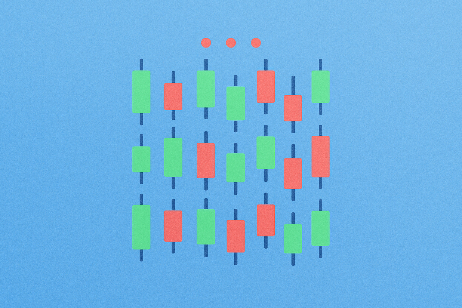
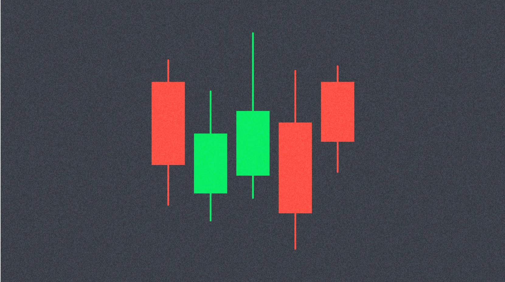
Candlestick charts represent one of the fundamental pillars of cryptocurrency trading, providing visual representations of price movements that enable investors to make informed decisions. Beyond spot trading, candlestick patterns allow traders to analyze market sentiment and momentum, helping predict price trends for assets like Bitcoin. A candlestick represents an asset's price movement over a specific time period, which can be customized according to the investor's strategy (such as 1 minute, 1 hour, daily, or monthly intervals).
Each candlestick displays four essential elements:
- Open: The asset's price at the beginning of the time period
- Close: The asset's price at the end of the time period
- High: The highest price reached during the time period
- Low: The lowest price observed during the time period
The candlestick body shows the difference between opening and closing prices, while wicks (or shadows) extend above and below to indicate the high and low levels. Candlesticks are typically color-coded for easy interpretation:
- Green: Closing price is higher than opening; indicates price increase
- Red: Closing price is lower than opening; indicates price decrease
For example, in a 5-minute green candle for BTC, if the opening is $60,000 and closing is $60,500, the candle body reflects this upward movement. If the high reached $60,700 and the low touched $59,800, the upper wick extends to $60,700 while the lower wick extends down to $59,800. This visual representation provides traders with immediate insight into price action and market dynamics.
Why Use Candlestick Charts?
Developed by Japanese rice traders in the 18th century, candlestick charts have evolved into an indispensable tool for modern investors. These charts offer significant advantages over simple line charts by visually reflecting price movements and market psychology in a comprehensive manner. The power of candlestick analysis lies in its ability to capture not just price levels, but also the emotional state of the market during each trading period.
Traders who analyze multiple candlesticks can identify potential price reversals or continuation patterns, facilitating critical trading decisions on leading platforms. The visual nature of candlestick charts makes them particularly effective for:
- Identifying support and resistance levels
- Recognizing trend strength and momentum
- Detecting potential reversal points
- Understanding the balance between buying and selling pressure
- Making quick decisions in fast-moving crypto markets
How to Read Candlestick Patterns?
Candlestick patterns form over time and indicate trends, reversals, or market indecision. While a single candlestick provides clues about price movement within its time frame, multiple candlesticks form larger patterns that reveal more about trend direction and potential future movements.
For instance:
-
A green candlestick with a long upper wick indicates that buyers pushed the price upward but encountered resistance, causing the price to close below its peak level. This suggests that while bullish momentum exists, sellers are actively defending higher price levels.
-
A red candlestick with a long lower wick implies that sellers drove the price down, but buyers stepped in to prevent a lower close, demonstrating support at lower levels and potential buying interest.
Candlestick patterns may appear complex initially; however, with regular analysis and practice, especially when combined with other technical indicators like RSI or Moving Averages, their predictive power becomes clearer. The key is to understand that each pattern tells a story about the battle between buyers and sellers, and recognizing these narratives can significantly improve trading outcomes.
8 Essential Candlestick Patterns for Crypto Trading
Candlestick patterns are classified as bullish (signaling price increase) and bearish (signaling price decrease). Understanding these patterns is crucial for successful crypto trading.
Bullish Candlestick Patterns
Hammer
-
Appearance: Forms at the bottom of a downtrend, featuring a small body at the top (green or red) with a long lower wick and little to no upper wick. The lower wick should be at least twice the length of the body.
-
Meaning: Indicates strong buyer interest following selling pressure, providing a reversal signal. This pattern demonstrates that although sellers pushed prices lower during the session, buyers emerged with sufficient strength to drive prices back up near the opening level. For example, if BTC drops to $58,000 but closes at $59,000 with a long lower wick, it suggests buyers are beginning to dominate the market, potentially signaling an upcoming rally.
-
Signal: Potential price increase or trend reversal. Confirmation comes when the next candle closes above the hammer's high.
Inverted Hammer
-
Appearance: Forms at the bottom of a downtrend, characterized by a small body (green or red), long upper wick, and almost no lower wick. The upper wick should be significantly longer than the body.
-
Meaning: Buyers attempted to push prices higher but encountered seller resistance. However, if followed by a green candle, it confirms the beginning of an uptrend. This pattern shows a shift in market dynamics where buyers are testing higher levels, even though they couldn't maintain those prices during the session.
-
Signal: Beginning of bullish momentum. Traders should wait for confirmation in subsequent candles before entering positions.
Bullish Engulfing
-
Appearance: Occurs at the end of a downtrend, consisting of a small red candle followed by a larger green candle that completely engulfs the previous candle's body. There may be a small gap between them (rare in crypto markets due to 24/7 trading).
-
Meaning: Strong buying pressure overwhelms sellers, and market sentiment turns positive. This pattern represents a decisive shift in control from sellers to buyers. For instance, if BTC's red candle closes at $60,000, and the following green candle opens at $59,800 and closes at $61,000, buyers have taken complete control of the market.
-
Signal: Strong bullish reversal. The larger the engulfing candle relative to the previous candle, the more significant the signal.
Morning Star
-
Appearance: Forms at the end of a downtrend as a three-candle pattern: a long red candle, a short-bodied "star" candle with long wicks (closing lower than the first candle), followed by a long green candle (closing above the midpoint of the first candle's body).
-
Meaning: Demonstrates that selling pressure is diminishing, followed by buyers taking control and initiating an uptrend. The middle "star" candle represents market indecision and the transition period between bearish and bullish control. This pattern is particularly reliable because it shows a complete shift in market sentiment over three distinct phases.
-
Signal: Bullish reversal pattern. The pattern is stronger when the third candle closes well into the first candle's body.
Piercing Line
-
Appearance: Forms at the end of a downtrend, featuring a long red candle followed by a long green candle that closes above the midpoint of the red candle's body. A gap may exist between the two candles.
-
Meaning: After a session that began with selling, buyers enter with strong momentum, demonstrating interest at current price levels. This pattern shows that the market has found support and buyers are willing to step in aggressively.
-
Signal: Bullish reversal with strong buying interest. The closer the green candle closes to the red candle's opening price, the more powerful the reversal signal.
Bearish Candlestick Patterns
Hanging Man
-
Appearance: Forms at the peak of an uptrend, featuring a small body (green or red) with a long lower wick and almost no upper wick. Despite its similar appearance to the hammer, its position at the top of an uptrend gives it bearish implications.
-
Meaning: Indicates intensifying selling pressure and weakening upward momentum. For example, when BTC peaks at $62,000 and closes at $61,500 with a long lower wick, sellers are entering the market. The long lower wick shows that sellers pushed prices significantly lower during the session, even though buyers managed to recover some ground.
-
Signal: Potential beginning of selling or downtrend. Confirmation is needed from the next candle, ideally a red candle closing below the hanging man's body.
Shooting Star
-
Appearance: Forms at the peak of an uptrend, characterized by a small body (green or red), long upper wick, and almost no lower wick. The upper wick should be at least twice the length of the body.
-
Meaning: Although buyers pushed prices higher, sharp rejection occurred with the close near the opening level, providing a reversal signal. This pattern demonstrates that higher prices were tested but firmly rejected, suggesting that the uptrend may be exhausted.
-
Signal: Bearish reversal following price increase. The pattern is more reliable when it appears after an extended uptrend and is confirmed by subsequent bearish price action.
Bearish Engulfing
-
Appearance: Forms at the peak of an uptrend, consisting of a small green candle followed by a large red candle that completely engulfs the previous candle's body. A gap may exist between them.
-
Meaning: Strong selling pressure dominates the market, and sentiment turns negative. This pattern represents a decisive power shift from buyers to sellers. For instance, if BTC's green candle closes at $62,000, and the following red candle opens at $62,200 and closes at $61,000, sellers have taken control of the market.
-
Signal: Beginning of downtrend. The larger the engulfing candle and the higher the trading volume, the more significant the bearish signal.
Combining Candlestick Patterns with Other Indicators
While candlestick patterns are powerful on their own, they become significantly more effective when used in conjunction with other technical indicators such as Relative Strength Index (RSI), Moving Averages, or Bollinger Bands. This multi-indicator approach helps reduce false signals and improves decision-making processes.
For example, a Bullish Engulfing pattern combined with RSI below 30 (oversold zone) provides a strong signal for potential upward movement. The RSI confirms that the asset is oversold, while the candlestick pattern shows buyers stepping in with force. Similarly, a Shooting Star appearing when price touches the upper Bollinger Band suggests strong resistance and increases the reliability of the bearish signal.
Experienced traders typically use multiple confirmations to validate their analysis:
- Volume confirmation: Higher volume during pattern formation increases reliability
- Trend alignment: Patterns are more reliable when they align with the broader trend
- Support/resistance levels: Patterns forming at key levels carry more weight
- Multiple timeframe analysis: Confirming patterns across different timeframes strengthens signals
Conclusion
Candlestick patterns serve as indispensable tools for cryptocurrency traders, offering crucial insights into market sentiment and potential price movements. Mastering these patterns can significantly enhance your trading strategy on leading platforms; however, success requires experience, careful attention, and disciplined execution.
To maximize the effectiveness of candlestick analysis:
- Always confirm signals with other technical indicators before making trading decisions
- Practice identifying patterns on historical charts to build recognition skills
- Understand that no pattern guarantees success; risk management remains essential
- Consider the broader market context and news events that may influence price action
- Start with the most reliable patterns and gradually expand your knowledge
- Maintain a trading journal to track which patterns work best for your strategy
By combining candlestick pattern recognition with sound risk management and complementary technical analysis tools, traders can develop a robust approach to navigating the dynamic cryptocurrency markets. Remember that responsible trading practices, continuous learning, and patience are key components of long-term trading success.
FAQ
What are candlestick patterns and what role do they play in cryptocurrency trading?
Candlestick patterns are visual representations of cryptocurrency price movements, showing opening, closing, high, and low prices. They help traders identify market trends and potential price reversals, enabling better trading decisions based on historical price action.
How to identify and interpret basic candlestick patterns such as hammer lines, engulfing patterns, and doji stars?
Hammer lines signal potential reversals with small bodies and long lower wicks. Engulfing patterns occur when a larger candle completely covers the previous one, indicating trend reversals. Doji stars show market indecision with nearly identical open and close prices. Dragonfly doji suggests bullish reversal, while gravestone doji indicates bearish reversal.
What are bullish and bearish patterns respectively? What trading signals do they each represent?
Bullish patterns like hammer and morning star signal potential price increases, suggesting buy opportunities. Bearish patterns like hanging man and evening star signal potential price decreases, suggesting sell opportunities. These candlestick formations help traders identify market direction shifts and make informed trading decisions.
What is the success rate of candlestick pattern analysis in actual cryptocurrency trading?
Candlestick pattern analysis has a relatively high success rate in crypto trading, typically 60-70% depending on market conditions and strategy. Success depends on strong signal confirmation, large engulfing bodies, and combining with other technical indicators for better accuracy.
Combine candlestick patterns with RSI for momentum confirmation and moving averages for trend direction. Use Bollinger Bands with engulfing patterns for breakout signals, and pair stochastic oscillators with piercing patterns for precise entry and exit points in your trades.
What are common candlestick wick traps in crypto trading and how to avoid being misled by false signals?
Common wick traps include false breakouts and liquidation wicks. Avoid false signals by combining multiple technical indicators, trend lines, and volume analysis. Confirm signals across multiple timeframes before trading decisions.
What are the differences in candlestick patterns across different timeframes (1-hour, 4-hour, daily)?
Different timeframes reveal price movements at varying scales. Longer timeframes like daily charts show stronger reversal signals than shorter ones like 1-hour charts. A hammer pattern on a daily chart indicates a full-day reversal, while on a 1-hour chart it shows only hourly reversal. Longer period patterns are more reliable for trading decisions.
What are the advantages and limitations of candlestick pattern analysis compared to other technical analysis methods?
Candlestick patterns offer clear visual recognition and identify specific formations like head-and-shoulders and double bottoms easily. However, they rely on historical data and may not accurately predict future trends. Combining with other indicators provides more comprehensive market insights.
* The information is not intended to be and does not constitute financial advice or any other recommendation of any sort offered or endorsed by Gate.