This comprehensive guide explores OHLC charts, fundamental technical analysis tools for cryptocurrency traders. OHLC—representing Open, High, Low, and Close prices—provides visual representations of asset price movements across specified timeframes. The article deconstructs each component and explains how OHLC data consolidates into bar charts and candlestick symbols, offering traders immediate insights into market dynamics. Readers learn practical interpretation techniques including vertical height analysis for volatility assessment, open-close positioning for sentiment evaluation, and trend identification through color-coded patterns. The guide details common candlestick formations like Doji, Dragonfly Doji, Hammer, and Marubozu patterns that signal potential reversals and entry/exit opportunities. A Bitcoin trading example demonstrates real-world application of pattern recognition. Whether trading on Gate or analyzing price action, mastering OHLC interpretation combined with complementary indicators enable
Understanding OHLC Charts in Cryptocurrency Trading
OHLC charts serve as fundamental tools for technical analysis, providing traders with comprehensive visual representations of price movements across various financial instruments including bonds, stocks, commodities, and cryptocurrencies. These charts offer a systematic approach to analyzing market behavior by consolidating four critical price points into easily interpretable graphical formats. When integrated with complementary technical indicators and analytical frameworks, OHLC charts become powerful instruments for forecasting potential price movements and identifying optimal trading opportunities in volatile cryptocurrency markets.
What Does OHLC Stand For?
The OHLC acronym represents four essential price metrics that define an asset's trading activity within a specified timeframe:
- O (Open): The initial price at which an asset begins trading during the designated period
- H (High): The maximum price point reached throughout the trading interval
- L (Low): The minimum price point recorded during the same period
- C (Close): The final price at which the asset concludes trading for that timeframe
These four data points can be measured across various temporal scales, ranging from minute-by-minute intervals to hourly, daily, or weekly periods, depending on the trader's analytical objectives. Different graphical symbols and representations are employed to display these collective criteria, which are subsequently plotted onto OHLC charts to create comprehensive visual narratives of price action.
What Does an OHLC Chart Look Like?
An OHLC chart presents a sequential arrangement of OHLC symbols that collectively illustrate the opening price, highest price, lowest price, and closing price of an asset throughout a designated timeframe. This visual representation enables traders to quickly assess market dynamics and price volatility patterns.
A typical OHLC chart features three fundamental components plotted on a two-dimensional graph. The vertical y-axis establishes a pricing scale for the asset, which in practical applications might range from $0 to $400 or any relevant price range appropriate to the asset being analyzed. This scale provides the reference framework for interpreting price movements.
The horizontal x-axis displays a time scale divided into uniform increments. For instance, in daily analysis, the time scale might be segmented into 24-hour periods labeled as Day 1, Day 2, and Day 3. Each time segment corresponds to one OHLC symbol, creating a chronological sequence of price action data.
The chart incorporates one distinct OHLC symbol for each segmented time period. For example, the initial OHLC symbol in a sequence (often denoted in red) represents the four OHLC price points for the asset during the first timing segment. While standard OHLC charts typically employ black symbols, color coding is frequently utilized to provide immediate visual feedback regarding price direction. Red symbols designate bearish periods where prices declined, while green symbols indicate bullish periods characterized by price appreciation.
How Are Different Types of OHLC Chart Symbols Structured?
OHLC charts predominantly utilize two distinct symbol types: bar chart symbols and Japanese candlestick symbols. Each format offers unique visual advantages for interpreting price action.
OHLC Bar Chart Symbols
Bar chart symbols are categorized into two primary types based on price direction: bullish symbols and bearish symbols, each conveying distinct market sentiment.
A Bullish Bar Chart Symbol
A bullish OHLC bar chart symbol incorporates multiple visual elements that collectively represent an asset's price behavior during a specific period:
- A primary vertical bar extends from the designated low price to the high price, with its length representing the complete pricing range experienced during that timeframe. A longer bar indicates greater price volatility.
- Two horizontal tick marks project at right angles from the primary bar, positioned to indicate opening and closing prices:
- The left-hand tick mark represents the "open" price, indicating the asset's valuation at the period's commencement
- The right-hand tick mark represents the "close" price. When this closing tick mark appears higher than the opening tick mark, the symbol designates a bullish period, indicating net upward price movement
A Bearish Bar Chart Symbol
In a bearish OHLC symbol, the closing price falls below the opening price, creating what traders commonly refer to as a "down day." This configuration indicates that selling pressure dominated the trading period, with sellers actively driving prices lower toward the close. The visual representation immediately communicates negative price action to technical analysts.
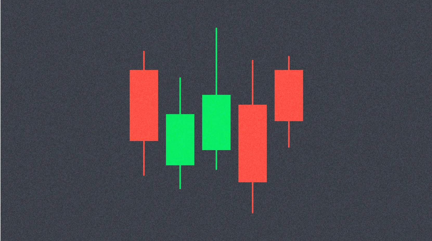
Japanese or Candlestick Symbol
Candlestick symbols provide an alternative method for graphically representing the four OHLC price points, offering enhanced visual clarity through color-coded bodies and extended wicks.
The candlestick symbol features a main rectangular body extending vertically between the opening and closing prices. This vertical dimension represents the core price range traversed during the specified period, providing immediate insight into the magnitude of price movement.
A bullish candlestick symbol occurs when prices advance from a lower opening to a higher closing value. In many charting applications, bullish candlesticks are filled with green or rendered entirely in black, serving as an immediate visual indicator of upward price movement or an "up day."
Conversely, bearish candlesticks feature either hollow rectangular bodies or red-colored fills, signaling that the opening price exceeded the closing price. This configuration represents downward price movement or a "down day."
Depending on the asset's price volatility, candlestick symbols may display two additional elements called "shadows" or "wicks." The upper shadow extends above the rectangular body, while the lower shadow projects below it. These shadows indicate the extreme high and low prices achieved during the designated timeframe, providing crucial information about intraday price rejection and market sentiment.
In bearish candlestick representations, the opening price appears above the closing price, and the rectangular body is typically colored red to emphasize the negative price action.
How To Read an OHLC Chart?
Interpreting OHLC symbols requires understanding several key analytical techniques that reveal underlying market dynamics.
Vertical Height Analysis
The vertical dimension of an OHLC symbol directly correlates with the asset's price volatility during that period. Greater vertical height indicates larger price swings and wider trading ranges. Symbols exhibiting substantial vertical length over given timeframes typically characterize highly volatile assets, which present both increased risk and potential reward for traders. Conversely, shorter symbols suggest price stability and reduced volatility.
Open and Close Positioning
The relative positioning of opening and closing prices provides technical traders with valuable insights into market sentiment and momentum shifts.
When an asset displays a large positive wick but closes significantly below its high, this pattern suggests that initial buying enthusiasm diminished toward the period's conclusion, potentially indicating weakening bullish momentum. Similarly, if an asset exhibits a large negative wick but closes substantially above its low, this configuration implies that selling pressure subsided before the period ended, possibly signaling a bullish reversal.
Market indecision manifests when opening and closing prices cluster closely together, indicating that neither buyers nor sellers achieved significant directional progress. When the closing price falls far below the opening price, this pattern demonstrates strong sustained selling pressure throughout the period. Alternatively, when the close substantially exceeds the open, it evidences robust buying activity and bullish sentiment.
Trend Identification
Sequential clustering patterns provide crucial information about prevailing market trends and their relative strength. A consecutive series of green bars typically represents an established uptrend, indicating sustained buying pressure and positive price momentum. During downtrends, red bars predominate over green bars, reflecting persistent selling pressure. Analyzing these color-coded clusters enables traders to assess both trend direction and the intensity of directional movement, facilitating more informed trading decisions.
What Are Some Common OHLC Symbol Patterns?
Certain recurring OHLC symbol formations serve as recognized technical indicators for predicting potential market reversals and identifying strategic entry and exit points.
Doji Pattern
A Doji symbol forms when opening and closing prices are essentially equal, creating a cross-like appearance. While the lengths of the Doji's upper and lower shadows may vary, the defining characteristic remains the minimal difference between open and close prices. When a Doji appears following a sequence of bearish red symbols, it often signals potential trend exhaustion and may precede a bullish reversal, making it a critical pattern for timing market entries.
Dragonfly Doji Pattern
The Dragonfly Doji represents a specialized formation typically occurring when both opening and closing prices align at or near the period's highest point. This pattern features no upper shadow extending from the high, creating a distinctive T-shaped appearance. A Dragonfly Doji with an extended lower shadow generally indicates bullish sentiment, as it demonstrates that despite significant downward pressure during the period, buyers successfully pushed prices back to opening levels by the close. When this pattern emerges at significant price bottoms, it frequently signals potential trend reversals and upward momentum shifts.
Hammer Pattern
The hammer candlestick can function as either a bullish or bearish signal depending on its context within the broader trend. This pattern consists of a small body positioned near the high price, minimal or absent upper shadow, and a characteristically long lower shadow. When hammer patterns form during established bearish trends, they typically indicate bullish reversals, suggesting that selling pressure is weakening and buyers are beginning to assert control. The extended lower shadow demonstrates that despite significant downward movement during the period, buyers successfully defended lower price levels.
Marubozu Pattern
Marubozu signals are distinguished by elongated candlestick bodies with no visible upper or lower shadows, indicating strong directional conviction throughout the entire trading period.
A bullish Marubozu features a long body formed when the opening price equals the low and the closing price equals the high. This configuration demonstrates that buyers maintained complete control from the period's opening through its close, representing exceptionally strong bullish sentiment and momentum.
A bearish Marubozu displays a long black or red body, occurring when the opening price equals the high and the closing price equals the low. This pattern indicates that sellers dominated price action throughout the entire period, suggesting powerful bearish momentum and continued downward pressure.
OHLC Bitcoin Candlestick Chart: A Practical Example
Analyzing a Bitcoin OHLC candlestick chart based on one-minute time segments demonstrates the practical application of these pattern recognition techniques in real-world cryptocurrency trading scenarios.
In a typical trading sequence, around 14:01, two consecutive red candlesticks signal the initiation of a downtrend, even when the second candlestick's opening price exceeds the first candlestick's closing price. This pattern indicates increasing bearish momentum.
Subsequently, a green Doji emerges. Given that preceding symbols exhibited bearish characteristics, this Doji serves as a technical indicator suggesting Bitcoin may be transitioning toward a bullish trend. This prediction materializes starting at 14:04, validating the Doji's predictive value.
The bullish trend continues until a bearish hammer appears at 14:06. Importantly, when hammer patterns form during bullish trends, they paradoxically serve as bullish continuation signals, suggesting the uptrend will persist.
Following this signal, a sequence of green candlesticks confirms the sustained uptrend. This bullish phase includes a green Marubozu signal, providing strong evidence of continued bullish momentum and buyer dominance.
A brief bearish trend emerges thereafter, which is subsequently interrupted by another bullish Doji. This Doji again indicates potential bullish trend resumption, demonstrating the recurring predictive utility of these candlestick patterns in cryptocurrency market analysis.
Conclusion
Both bar symbols and candlestick symbols represent powerful analytical tools for forecasting asset price action in cryptocurrency and traditional financial markets. These OHLC representations provide traders with immediate visual comprehension of four critical price characteristics—open, high, low, and close—across any specified timeframe. By mastering the interpretation of these symbols and recognizing common pattern formations, traders can develop more sophisticated technical analysis capabilities, enhance their market timing decisions, and ultimately improve their trading performance in dynamic cryptocurrency markets. The integration of OHLC chart analysis with complementary technical indicators creates a comprehensive framework for navigating complex market conditions and identifying high-probability trading opportunities.
FAQ
What is an OHLC Chart? What does each letter in OHLC represent?
OHLC represents Open, High, Low, and Close prices. Each letter shows the opening price, highest price, lowest price, and closing price during a specific time period, helping traders analyze price movements and identify trends.
In OHLC charts, the opening price is shown on the left horizontal line, closing price on the right, highest price at the top, and lowest price at the bottom. Green candles indicate the closing price is higher than the opening price (uptrend), while red candles show the opposite (downtrend). The vertical line represents the price range.
How do OHLC charts help predict price action and market trends?
OHLC charts display open, close, high, and low prices, revealing price patterns and trends. Combined with moving averages and trading volume analysis, they enable traders to identify support/resistance levels, momentum shifts, and potential trend reversals for better market prediction.
What is the difference between OHLC charts and other chart types such as line charts and bar charts?
OHLC charts display open, high, low, and close prices in detail, ideal for analyzing price action. Line charts show trends over time, while bar charts compare data across categories. OHLC is superior for identifying trading patterns and support/resistance levels.
How to use OHLC data to develop trading strategies in actual trading?
OHLC data helps traders identify price trends and support/resistance levels. Plot open, high, low, and close prices on charts to analyze patterns, determine key price levels, and time entry/exit points for better trading decisions.
What impact do timeframes in OHLC charts have, such as 1 minute, 1 hour, and 1 day?
Different timeframes significantly affect trading strategies and volatility visibility. Shorter timeframes like 1-minute show detailed price movements and frequent fluctuations, ideal for scalping. Longer timeframes like 1-day reduce noise and reveal major trends, suitable for swing trading. Choose timeframes based on your trading style and risk tolerance.
* The information is not intended to be and does not constitute financial advice or any other recommendation of any sort offered or endorsed by Gate.